ТОР 5 статей:
Методические подходы к анализу финансового состояния предприятия
Проблема периодизации русской литературы ХХ века. Краткая характеристика второй половины ХХ века
Характеристика шлифовальных кругов и ее маркировка
Служебные части речи. Предлог. Союз. Частицы
КАТЕГОРИИ:
- Археология
- Архитектура
- Астрономия
- Аудит
- Биология
- Ботаника
- Бухгалтерский учёт
- Войное дело
- Генетика
- География
- Геология
- Дизайн
- Искусство
- История
- Кино
- Кулинария
- Культура
- Литература
- Математика
- Медицина
- Металлургия
- Мифология
- Музыка
- Психология
- Религия
- Спорт
- Строительство
- Техника
- Транспорт
- Туризм
- Усадьба
- Физика
- Фотография
- Химия
- Экология
- Электричество
- Электроника
- Энергетика
Articles and Essays 6 страница

 Illustration of Natural Deselection, 2006 Tim Simpson
 Natural Deselection, 2006 Tim Simpson
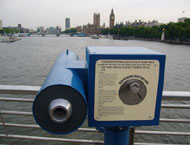 Subversive Sightseeing, 2006 Tim Simpson
 Subversive Sightseeing, 2006 Tim Simpson
 Subversive Sightseeing, 2006 Tim Simpson
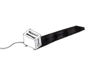 Suspenseful Products, 2006 Tim Simpson
| Article 17. Tim Simpson Product Designer (1982-) Design Mart – Design Museum Exhibition 20 September 2006 – 7 January 2007 Design in the new millenium has become more surreal and slightly subversive as emerging designers explore a darker side. Rather than shy away from complex psychological issues, designers such as Tim Simpson (1982-) are challenging our emotional connection to objects and the material world through their work. As part of his degree show from the Royal College of Art’s Product Design course, Simpson exhibited Natural Deselection – a device that empowers plants to control the fate of others using sensors and mechanised shears in a Darwinian race for survival. The sensors, arranged above the plants, detect the first plant to reach a specified height, at which point it is saved, and the others are fatally chopped. As an installation, the instrument provokes thought about the passage of time, fate and suspense, exploiting our emotions as we encourage all the plants to grow despite the brutal climax their growth will inevitably harvest. Simpson’s diverse range of work – products, films and installation pieces – reflect his fascination with psychological suspense and Hitchcock thrillers, by captivating his audience in anticipation of the usually violent finale. Rich in narrative and cultural observation, Simpson’s work acknowledges a brutal truth or reality that exists within society – but is tempered by dry humour and wit. Subversive Sightseeing, for example, replaced the regular vista of a coin operated public telescope with a digital film of the same London landscape but with superimposed scenes of destruction, including Big Ben exploding, tower blocks falling down. Installed on Hungerford Bridge, it was intended as a wry comment on our cinematic ingenuity and the ramifications events such as 9/11 have on our collective imaginations. © Design Museum Q. When did you first become aware of – and interested in – design? A. I grew up Swindon, which already poses a number of problems as a practicing designer. I remember before being interviewed for the design course at Kingston my foundation teacher telling me to say that I read Blueprint magazine, even though it was impossible to find a design magazine in my home town. I suppose my awareness of design was a fairly gradual one, but I must in some way attribute it to the Argos catalogue and a good box of Lego. Q. Why did you decide to study design? A. Until the very last minute I almost studied painting. I used to do some terrible pieces with mixed media which, up until recently, my parents insisted on putting on their walls. I chose to study design instead because I imaged a solitary career as an artist, and thought that design represented a better investment for my education. Q. What was the influence of your design education on your work? A. I think it helped coming into design from a fine art background. I began my design education with a fairly naïve outlook about design, but this helped my education because I had not really established any presumptions about what design was. I was fortunate enough to study on courses that offered enough space for you to develop your own ideologies. Q. What were your design objectives as a student? A. As a student at the Royal College of Art I developed a fascination with thrillers and Hitchcock in particular. I enjoyed analysing the narrative methods used to engage a viewer through a plot, such as timing and suspense. I believe that these notions might also have a place in a design context, and spent a lot of time exploring this with my work. Q. Which of your early projects was most important in defining your approach to your work? A. The Natural Deselection project defines where I see my work nicely although it is unconventional in a design sense. It developed out of an interest in timing and suspense. I intended to build an instrument that provokes thought about the passage of time, fate and suspense, and plants offered the slow, tantalizing unpredictability, as well as an emotional engagement with the inevitable violent climax. The Darwinian concept of competition came later by way of adding value to the victorious plant. The process itself is a spectacle; a stimulating experience that aims to engage viewers in suspenseful anticipation. The outcome is a product; a winning plant, that has an added psychological value that is appreciated and valued by experiencing the instrument in use. The piece has attributes that could place it in both a design context and an art gallery, and I see this as an interesting space. Alfred Hitchcock has a nice anecdote that I like to recall when describing the context of my work: Two spies are travelling on an English train and one says to the other, “What’s that in the luggage rack over your head?” “Oh,” he says, “that’s a MacGuffin.” The first one asks, “Well, what’s a MacGuffin?” “It’s an apparatus for trapping lions on the Scottish Highlands,” So the other says “But there are no lions on the Scottish Highlands.” And he answers “Then that’s no MacGuffin”. Q. How have your objectives evolved since leaving the RCA? A. I’m not sure they have changed. I’m currently working on a more ambitious Natural Deselection project as well as series of products entitled ‘Suspenseful Products’; a series of domestic appliances that have a slow but dramatic function waiting to occur. Q. How important is the balance between commercial and conceptual in your work? A. It is important because it’s the commercial aspect of my work that places it in a design context. As I have only just started to establish my professional practice, the success of my work will be in finding a successful balance between the two. timsimpson.net © Design Museum |

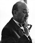
 Allen Lane Founder of Penguin Books
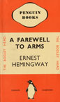 A Farewell to Arms by Ernest Hemingway, 1935 edition Design: Edward Young Publisher: Penguin Books
 Ariel by André Maurois, 1935 edition Design: Edward Young Publisher: Penguin Books
 Jan Tschichold (1902-1974) Head of design, Penguin Books, 1946-1949
 Don't, Mr Disraeli by Caryl Brahms and S.J. Simon, 1949 edition Design: Jan Tschichold Publisher: Penguin Books
 The Second Part of Henry the Fourth by William Shakespeare, 1947 edition Design: Jan Tschichold Publisher: Penguin Books
 Germano Facetti (1926-) Art director of Penguin books, 1961-1972
 Poster for an exhibition of Germano Facetti's work for Penguin Books at the Galleria Aiap, Milan
 Covers for Penguin Education series, 1971 Design: Derek Birdsall Publisher: Penguin Books
 The Farewell Party by Milan Kundera, 1984 edition Design: Carroll & Dempsey Publisher: Penguin Books
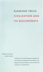 Civilization and its Discontents by Sigmund Freud Design: David Pearson for the Great Ideas series, 2004 Publisher: Penguin Books
 On the Shortness of Life by Seneca Design: Phil Baines for the Great Ideas series, 2004 Publisher: Penguin Books
| Article18. Penguin Books Book Publisher (1935-) Designing Modern Britain - Design Museum Exhibition Until 26 November 2006 When PENGUIN was founded in 1935 with the radical concept of producing inexpensive paperback editions of high quality books, it adopted an equally progressive approach to typography and cover design. Under Jan Tschichold in the 1940s and Germano Facetti in the 1960s, Penguin became an exemplar of book design. Returning to London from a weekend at the Devon home of the crime writer Agatha Christie in 1934, the publisher Allen Lane scoured Exeter Station for something to read. All he could find were reprints of 19th century novels and Lane decided to found a publishing house to produce good quality paperbacks sold at sixpence each, the same price as a packet of cigarettes. Lane’s secretary suggested Penguin as a “dignified, but flippant” name for the company and the office junior Edward Young was sent to sketch the penguins at London Zoo as its logotype. Young was then asked to design the covers of the first set of ten paperbacks to be published in summer 1935 including Ariel and A Farewell to Arms. Considering illustrated book covers to be trashy, Lane insisted on his following a simple horizontal grid for Penguin’s jackets in colours that signified the genre of each book: orange for fiction, green for crime, and blue for biography. The rigorous application of colour, grid and typography in those early paperbacks instilled Penguin with a commitment to design from the start. The company then strengthened its design ethos under the direction of the German typographer Jan Tschichold (1902-1974) during the 1940s and the Italian art director Germano Facetti (1926-) in the 1960s. The enduring principles of Penguin’s design were defined by Allen Lane when he founded the company in the mid-1930s, but it was not until the late 1940s that it adopted a disciplined and coherent approach to design under Jan Tschichold. Already established as an eminent writer on typography and a famous practitioner by the time he arrived at Penguin in 1946, Tschichold was more assertive at imposing his design philosophy than his predecessors. Before his arrival the design of individual books had appeared cohesive, at least compared to those of rival publishers, but had varied with the views of the editor and printer. A firm believer in typographic systems, Tschichold designed a template for all Penguin books with designated positions for the title and author’s name with a line between the two. He unified the design of the front, spine and back and redrew Edward Young’s endearingly amateurish Penguin symbol in eight variations. Finally he produced a set of Composition Rules which, he insisted, were to be followed by Penguin’s typographers and printers to ensure that the same style was always applied. Tschichold was equally rigorous in the design of special sets of books published by Penguin. These included Penguin Modern Painters, introduced in 1944 by the art historian Sir Kenneth Clark to popularise modern art to “the wide public outside the art galleries”, and the Penguin Shakespeare Series, which had the same democratising objective for William Shakespeare’s plays. Among Tschichold’s innovations was to persuade Allen Lane to allow Penguin to take advantage of recent advances in printing by using illustration on the jackets of particular sets of books such as the Shakespeare Series. In 1949 Tschichold returned to Switzerland after three highly productive years in which he had defined an intellectually rigorous and inspiring visual language for Penguin. His successor, the typographer Hans Schmoller (1916-1985) had a rich knowledge of type and unerring eye for detail, but was less radical in his approach and tended to refine Tschichold’s templates rather than inventing his own. Schmoller’s design for the 1950s architectural series, The Buildings of England written by the historian Nikolaus Pevsner, was modelled closely on Tschichold’s templates. However he did change the Penguin grid from horizontal to vertical in 1951. The vertical grid had been devised at Tschichold’s behest by the designer Erik Ellegaard Frederiksen, but was not adopted until Schmoller had modified it. The result was the division of the cover into three vertical stripes, which allowed enough space for illustration while maintaining the tri-partite division and the original 1930s colour coding so strongly associated with Penguin. By the early 1960s Penguin, once a pioneer in book design, had lost its edge. In 1961 the company appointed the Italian art director Germano Facetti, who had studied architecture in Milan and worked for Domus magazine there before moving to London to design for Olivetti, then renowned for its inventive approach to contemporary design, as its new head of design. In an era when London’s fledgling graphic design scene was invigorated by the emergence of talented Britons like Alan Fletcher, Colin Forbes and Derek Birdsall, and the arrival of the gifted US designers, such as Robert Brownjohn and Bob Gill, Facetti was charged with revitalising Penguin’s design tradition. One of his most inspiring projects was the redesign of Penguin Crime. In 1962 Facetti commissioned the Polish-born designer Romek Marber, having admired his covers of The Economist, to redesign the series. Green was retained as the defining colour of Penguin Crime, but Marber refreshed it by choosing a brighter shade. The horizontal title band at the top stayed too, as did the hierarchy of information – logo, series and price, then title, followed by the author’s name – with rules dividing each band. Marber then added a visually compelling image, often a staccato photograph or illustration hinting at the drama and tensions of the plot. The redesign was so successful that Facetti adopted variations of it for other Penguin series. For Penguin Classics, he introduced the use of an historic painting, invariably reflecting the themes of the book, to the covers and for Penguin Modern Poets, he commissioned a series of photograms by Peter Barrett, Roger Mayne and Alan Spain between 1962 and 1965. One of Facetti’s final projects before leaving Penguin in 1972 was to commission Derek Birdsall to redesign its education titles. In just over a decade at Penguin, Facetti succeeded not only in modernising its approach to design, but doing so in a coherent way across hundreds of titles. At a time when publishers still tended to commission design on a title-by-title basis, described by Facetti as “the arty-crafty approach of the single beautiful achievement”, he had succeeded in establishing consistently high standards of inspiring and often provocative design in a systematic manner appropriate to a modern publisher of mass-market books in the 1960s. Penguin has since revived its design heritage with particular series, notably the mid-1980s King Penguins collection of contemporary fiction with a cover grid designed by Mike Dempsey and Ken Carroll featuring the work of such illustrators as Andrei Klimowski. In 2004, Penguin published the Great Ideas series of social, political and philosophical tracts in paperback for £3.99 each. Penguin’s art director Jim Stoddart asked a junior designer, David Pearson, to develop the design identity of the series which he did by dressing each cover in the lettering or typographic style typical of its time in a rigorous palette of black and burgundy type on creamy white – from the replica of a grimy 18th century theatrical bill for Jonathan Swift’s A Tale of a Tub, to an Arts and Crafts style bookplate for John Ruskin’s discourse On Art and Life. When Penguin decided to celebrate its 70th anniversary by publishing a collection of 70 Pocket Penguins paperbacks to sell for £1.50 each, the design was entrusted to art directors John Hamilton and Jim Stoddart. As timing was tight, Hamilton hit upon the idea of inviting 70 designers, artists and illustrators to create one cover each. He and Stoddart then resolved that the covers should be designed within seven days for a flat fee of £70. All the designers they approached said ‘yes’. In deference to Penguin’s heritage, each book was the A-format size of its original 1935 paperbacks, and some of the cover designers were Penguin veterans, such as Alan Aldridge, Derek Birdsall and Romek Marber. The finished collection of 70 covers acts as a panorama of contemporary graphic design and illustration: from Peter Saville’s glacial typography for Homer and David Shrigley’s sinister drawing for Freud, to the elaborate sculpture on Julie Verhoeven’s F. Scott Fitzgerald cover. HISTORY 1935 Allen Lane launches the first set of twelve Penguin paperback books by contemporary authors such as Ernest Hemingway and Agatha Christie. Each book sells for sixpence, the same price as a packet of cigarettes. 1936 Penguin becomes an independent from Lane’s former employer, Bodley Head. It distributes its books from the crypt of the Holy Trinity Church on Marylebone Road, London where a fairground slide is installed to bring deliveries down from the street. 1937 The first new Penguin imprint is launched when Pelican is founded to publish books on history, sociology, economics and politics. 1946 German typographer Jan Tschichold is appointed head of design and devises rigorous design templates for all Penguin’s books. He persuades Allen Lane to accept illustrated covers for some books. 1949 After Tschichold’s return to Switzerland, the more conservative Hans Schmoller takes charge of design at Penguin. 1951 Introduction of the vertical grid designed by Erik Ellegaard Frederiksen in place of the original horizontal grid refined by Tschichold. 1961 Appointment of the Italian art director Germano Facetti as head of design at Penguin. 1962 Facetti charges Romek Marber with redesigning the Penguin Crime series and commissions striking photogram covers for the Penguin Modern Poets series from Peter Barrett, Roger Mayne and Alan Spain. 1972 Derek Birdsall is commissioned to redesign all Penguin’s education titles, including the University series of books. Facetti leaves Penguin. 1984 Mike Dempsey and Ken Carroll devise a constructivist-inspired grid for the King Penguin series of contemporary fiction with illustrations by Andrzej Klimowski. 2004 The Great Ideas of political, social and philosophical books is designed by David Pearson with art director Jim Stoddart. 2005 The Penguin design team responsible for the Great Ideas series is nominated for the Design Museum's Designer of the Year prize. Launch of the Pocket Penguin 70s series of paperbacks to celebrate Penguin's 70th birthday. FURTHER READING Jack E. Morpurgo, Allen Lane: King Penguin, Hutchison, 1979 Hans Schmoller, Two Titans: Mardersteig and Tschichold: A Study in Contrasts, British Library Publishing Division, 1990 Steven Hare, Penguin Portrait: Allen Lane and the Penguin Editors, 1935-1970, Penguin Books, 1995 Jan Tschichold, The New Typography: A Handbook for Modern Designers, University of California Press, 1928 original, 1998 edition Jan Tschichold, The Form of the Book: Essays on the Morality of Good Design, Hartley & Marks edition, 1996 Ruari McLaean, Jan Tschichold: a Life in Typography, Princeton Architectural Press, 1997 Alan Fletcher + Germano Facetti, Identity Kits: A Pictorial Survey of Visual Signals, Studio Vista, 1971 penguin.co.uk; designmuseum.org/designinbritain; © Design Museum |
 Hilary Cottam © Edmund Clark
 Kingsdale School, London Architecture by dRMM © dRMM Photography by A. de Rijke
 Model Prison Architecture by Buschow Henley © Buschow Henley Ltd.
 Model Prison Architecture by Buschow Henley © Buschow Henley Ltd.
 Model Prison Architecture by Buschow Henley © Buschow Henley Ltd.
 Hilary Cottam (on the right) participating in a Learning Works workshop at HMP Wandsworth in London
 An inmate welding at HMP Dartmoor in Devon
 A hairdressing class at HMP Downview in Surrey
| Article 19. Hilary Cottam Design Strategist (1965-) Designer of the Year 2005 From radically rethinking the design of the UK's schools, the prison system and health service, to her work as director of the Design Council’s experimental RED team, HILARY COTTAM (1965-) is championing a more inspiring and efficient approach to design in the public sector. Design affects every area of our lives – whether or not we are aware of it. One area where the quality of design affects us most is in the public sector: in the design of our schools, hospitals, housing and the prison and transport systems. Hilary Cottam champions a more inspiring and efficient approach to public sector design by demonstrating how design can be used as a tool to “tackle some of the more intractable social problems of our day”. Born in London in 1965, Cottam studied at Oxford, Sussex and the Open University and worked for the World Bank in Africa and Latin America. As founder of School Works, she collaborated with teachers, students, designers and other professionals to identify what we need from the design of our schools today – in terms of the curriculum and management systems, as well as the buildings. The government invested £10 million to test these ideas in a pilot project, Kingsdale School in Dulwich, south east London - which was redesigned by the architects dRMM - and has since adopted School Works’ proposals in many areas of education policy. Cottam then analysed how design could address the problems of the prison system, critically by curbing re-offending. As founder of the Do Tank, she assembled a team to reinvent the design of the prison and the way it operates for the 21st century. Now the director of the Design Council’s experimental RED unit, Hilary Cottam is working to redefine the role of design in other areas of life, starting with health, transport and citizenship. © Design Museum Q. How do you describe what you do? A. I use design to tackle some of the more intractable social issues of our day. I see myself as a facilitator, problem solver and inventor. All the projects are developed by a team which includes designers, other professionals from a range of disciplines, front-line workers and members of the public who, with me, are challenged through the design process to abandon their initial preconceptions and co-create something new and beautiful that works. Q. When did you first become interested in design? A. I don’t remember a time when I wasn’t interested in design. I grew up in Spain where colour, form and attention to detail seem an organic part of life: beribboned pastries, the intricate embroidery and cut of Moorish war tents. Q. And when did you first become interested in design and the public sector? A. For several years I lived and worked in a barrio in the Dominican Republic - a network of open sewers inhabited by 40,000 people in the heart of the capital city. I became increasingly struck by the way design in the form of the built environment, domestic surroundings and personal possessions affected people’s emotions and through this, their social and economic opportunities. This experience changed my thinking on urban regeneration and issues of social policy more generally and since then I have been developing a design- driven approach. It seems clear to me that public policy cannot succeed if these issues and most importantly people’s opinions of them are overlooked. Q. What do you consider to be the principal shortcomings in the conventional public sector approach to design? A. Despite rhetoric to the contrary the public sector continues to be driven by short term calculations of cost. The failure to compute the emotional, social and therefore economic benefits that accrue from good design has led to procurement processes which exclude the real experiences and needs of the people who will use the buildings, objects and experiences that are designed. For example, we are happy to continue building cheap, sub-standard housing to warehouse a population in need, while failing to connect the huge personal and social costs that result. Those responsible for commissioning design in the public sector largely fail to appreciate its potential. Briefs are issued which ask the wrong questions and thereby fail to capitalise on the wealth of design talent within the UK. Q. How can those problems be addressed? What differentiates your approach to public sector design to conventional approaches? A. Three things seem key. Firstly within my approach all briefs are developed in partnership with those who will work with and use whatever is to be the final product. This is not simply a consultation exercise or populism, but a rigorous design process whereby a range of professionals work with users to develop a solution. Secondly all projects develop practical, workable solutions for the users while also developing policy guidelines – a set of principles which could help to change the framework within which future designs will be commissioned. Thirdly we have an underlying principle of smart spending. All my projects are developed within the same budgets as traditional approaches. We don’t need to spend more, we just need to spend differently. Sometimes this results in solutions which turn out to be cheaper than those developed through more traditional approaches. Q. How did you come to found School Works? A. In 1997 the government announced that millions of pounds were to be spent on refurbishing the UK’s post-war secondary schools. Our world has changed dramatically since the 1950s and so has education - intuition suggested that it would be a wasted investment to simply refurbish these schools. With the Architecture Foundation and Demos I initiated a project to explore contemporary ways of tackling this problem, which led to the creation of School Works. Working with my colleague Sarah Vaughan Roberts, we ran a series of workshops with pupils and staff in a range of London schools. This gave us a plethora of ideas as to how things should be done differently to support 21st century learning. The Architecture Foundation published our ideas and sent them in a pamphlet to every secondary school in England. The resulting publicity helped us persuade the Schools Minister of the time to commit £10 million to put our ideas into practice. This led to the revitalisation of Kingsdale School in south London. Q. What is the role of design in the revitalisation of a school like Kingsdale? A. At Kingsdale, it was not only the building that was re-designed, but the curriculum and management structure too. It is critical that all three work together because an award-winning building alone will not change the fortunes of a school. Our work there was conducted in an extensive process that involved pupils, staff, parents, the architects de Rijke Marsh Morgan, educational experts and psychologists. This design process was the first step in the revitalisation of the school, by boosting morale and supporting the leadership in persuading both pupils and staff that Kingsdale could have a different future. In 2004 Kingsdale went from being a condemned school in the “special measures” category to being one of the UK’s 20 most improved schools. Q. How did the prison project come about? A. The UK currently has the biggest prison building programme in its history. Following on from the success of School Works I was invited by a Treasury official to look at some of the newly built prisons. Coming new to this field I was shocked by what I found. The design of the “new” prisons differs little from those of the 19th century. The same long wings made famous in the 1970s television series Porridge house young men or women with little to do all day except learn to become better criminals. Six out of ten prisoners have such severe literacy difficulties that they are ineligible for any available work. Almost eight out of ten go on to re-offend within two years of release. Given that it costs £27,000 per year to keep a person in prison – ten times that spent on a secondary school pupil – it seemed to me there had to be a better way of doing things. I spent the next two years visiting prisons in the UK and abroad in a personal capacity, and running small workshops with prisoners and prison officers. Through their eyes I saw new opportunities and put together a team of architects, criminologists and prison governors to develop an alternative prison for the 21st century. Q. What is the 21st century prison like? A. We set ourselves the challenge of designing a prison that would contain prisoners at Category A, the highest level of security, cost no more to operate than current prisons, while freeing up resources to support a learning programme which is proven to reduce re-offending. Currently 80% of a prison’s resources are spent on security and 20% on programmes for the prisoners. With a design-led approach we have been able to reverse that ratio. Within the prison the design of all spaces, individual and communal, the use of technology and the planning of the day are designed to facilitate a learning programme for prisoners. By designing the building in the form of a house structure, we minimise the costly movement of prisoners while providing clear sight lines for surveillance, thereby freeing up staff time to support prisoners in their learning activities. The use of modern materials and technology reduces both the initial land costs and ongoing building maintenance. This concept has been welcomed by government officials and the private sector companies which are increasingly building and operating prisons. Towards the end of 2004 the House of Commons opened a select committee enquiry to look into the issues of learning raised by the project. Q. And how can design improve the efficiency of the health service? A. Design has so much to offer the health service: from simple interventions to make sure that staff wash their hands, to the more complex issues of the physical design of hospitals. Our current project, however, is focused on reducing the pressure on the system by designing services to prevent people from needing traditional health care altogether. The biggest challenge we now face as a nation is the prevalence of chronic disease. Diabetes alone absorbs 5% of the NHS budget. Yet however much we reform the health services on offer, they cannot address the long term management of these issues or promote the necessary lifestyle changes. At the Design Council, the RED unit is designing a new co-creation approach in which potential patients are working with health professionals in new partnerships to design innovative preventative services. Communities of this kind are well developed in open source software and other fields. Q. What is the role of the RED unit at the Design Council? A. We are an experimental unit challenging accepted thinking on economic and social issues through design innovation. We run rapid turnaround projects as opportunities to develop practical design solutions for a range of social issues while continuing to prototype design processes. Some of these projects are designed to provoke debate. Others provide the foundation for longer term Design Council campaigns. Through debate and the publication of RED papers we are also developing new thinking on big issues which make links to our practice. Our small inter-disciplinary team has been up and running for just over six months in which we have tackled issues of citizenship and health. Our approach is human-centred, open and collaborative and we invite comments through our blog: www.designcouncil.org.uk/RED. Q. Are there any other examples of interventions in design and the public sector that you admire – in the UK and elsewhere? A. Lots – I am learning all the time from others doing important work in this sector. Whilst it is possible to cite examples in the UK, the projects I admire most are all small scale, from playgrounds in Hackney to street furniture in Glasgow, largely the result of the work of individuals – both inside and outside the public sector – who are battling against the system. It is hard to think of an example of systemic intervention. Internationally the much-quoted, but still inspirational example must be that of the Brazilian city of Curitiba, where design is at the heart of a human-centred approach to urban policy. The result is the development of new housing, sustainable transport and waste collection systems to name but three, which have been copied the world over. Q. What are your priorities for future projects? A. There is much to be done. With prisons the argument is still to be won and, in education, while the principles of School Works are now widely accepted, there remain the challenges of large scale implementation in the context of often unrealistic government timelines. For the future, two subjects are particularly dear to my heart: housing, where the design process might help to unlock entrenched debates and the design of the product is so important; and transport where again I believe that our approach has much to offer questions of mobility in terms of both process and product. BIOGRAPHY 1965 Born in London. 1984 Studies modern history at Oxford University. 1987 Joins the humanitarian arm of the Tigrayan People’s Liberation Front, working in Northern Ethiopia. 1989 Appointed field representative for CARE International in the Dominican Republic. 1991 Returns to the UK to complete a master’s degree at Sussex University. 1993 Joins the World Bank in Washington DC as an urban policy specialist with responsibility for Southern Africa. 1996 Returns to the UK to complete a Doctorate in Social Sciences at the Open University. 1998 Founds School Works with the Architecture Foundation and Demos, and is appointed a visiting fellow at the London School of Economics. 1999 Starts the Do Tank Ltd. and begins a research project into the future design of the UK prison system. 2000 School Works is awarded £10 million by the Department for Education to implement its ideas in the modernisation of the Kingsdale secondary school in Dulwich, south east London with the architects dRMM. The Department of Education forms a policy group to assess how to implement School Works’ proposals for the future design of schools. 2001 Joins the Design Council as Director of Learning and Public Services 2002 Publishes The Do Tank’s research into the design of the prison system as Learning Works: The 21st Century Prison. The proposals are endorsed by the prisons minister and the director of the Prison Service. 2004 Kingsdale School is completed and recognised as one of the UK’s 20 most improved schools. School Works starts to work with ten more schools. Cottam establishes the experimental RED Unit at the Design Council and becomes its director. RED launches a design strategy for citizenship. The House of Commons launches a select committee enquiry into prison learning. 2005 RED unveils a new design strategy for Health. Hilary Cottam is shortlisted for the Design Museum’s Designer of the Year prize. designcouncil.org.uk; |
Не нашли, что искали? Воспользуйтесь поиском: