ТОР 5 статей:
Методические подходы к анализу финансового состояния предприятия
Проблема периодизации русской литературы ХХ века. Краткая характеристика второй половины ХХ века
Характеристика шлифовальных кругов и ее маркировка
Служебные части речи. Предлог. Союз. Частицы
КАТЕГОРИИ:
- Археология
- Архитектура
- Астрономия
- Аудит
- Биология
- Ботаника
- Бухгалтерский учёт
- Войное дело
- Генетика
- География
- Геология
- Дизайн
- Искусство
- История
- Кино
- Кулинария
- Культура
- Литература
- Математика
- Медицина
- Металлургия
- Мифология
- Музыка
- Психология
- Религия
- Спорт
- Строительство
- Техника
- Транспорт
- Туризм
- Усадьба
- Физика
- Фотография
- Химия
- Экология
- Электричество
- Электроника
- Энергетика
Articles and Essays 1 страница


 Work from London, 1994 Design: Graphic Thought Facility Client: The British Council
 Digitopolis, 2000 Design: Graphic Thought Facility Client: Casson Mann/The Science Museum, London
 General Knowledge, 2000 Design: Graphic Thought Facility Client: Booth-Clibborn Editions
 Basic Delux Press Release, A/W 2001 Design: Graphic Thought Facility Client: Habitat
 Bit's World, 2001 Design: Graphic Thought Facility Client: Gabriele Capelli Editions
 Habitat re-branding, 2002 Design: Graphic Thought Facility Client: Habitat
 S/S 2001 Press Release Design: Graphic Thought Facility Computer rendering: Francois Lefranc Client: Habitat
 MeBox, 2002 Design: Graphic Thought Facility
 Earth Baskets, 2002 Design: Graphic Thought Facility
 Shakespeare's Globe Season 2003-2004, 2002/2003 Design: Graphic Thought Facility Photography: Nigel Shafran Client: Shakespeare's Globe Theatre
| Article 1. Graphic Thought Facility
Graphic Designers Design Museum Collection
By defining a distinctive graphic style to a diverse range of projects, GRAPHIC THOUGHT FACILITY has emerged as one of the UK’s most influential – and productive – graphic design teams. Founded in London in 1990 by Andy Stevens and Paul Neale, GTF now works for such clients as Habitat, Shakespeare's Globe Theatre and the Design Museum.
The work of Graphic Thought Facility is defined less by a distinctive visual language than the rigour with which the designers approach the process of developing and executing graphic projects. The defining characteristic of GTF’s finished work is its eclecticism. Drawing on a diverse range of typefaces – from robust use of Helvetica in the Digitopolis gallery at the Science Museum in London, to the curlicue lettering in marketing material for Habitat – printing techniques and materials, GTF reinvents its graphic style for each project.
Founded in London in 1990 by Paul Neale and Andy Stevens after they graduated in graphic design from the Royal College of Art GTF has since combined cultural projects – for Manchester Art Gallery, the Frieze Art Fair and Shakespeare’s Globe Theatre as well as the visual identity of the Design Museum – with commercial commissions from Habitat and the design of graphic-based products such as the MeBox storage system. Huw Morgan is now a partner of GTF alongside Neale and Stevens.
Q. What were your early design influences? What drew you to graphic design?
Andy: Malcolm Garrett’s Simple Minds sleeves and TDK cassette packaging.
Huw: Printing. My mother had friends that were printer-makers - in the fine art sense - and I used to watch them avidly. They taught me about litho, we used stones and wax crayons instead of metal plates and films. I liked the process.
Paul: Probably the books and toys I had as a child.
Q. Do you feel that your education (design or otherwise) influenced the way you work now?
Andy: Leeds was very social and unpressured, I aspire to a working day that is like this! I found Derek Birdsall a big influence at the Royal College of Art.
Huw: In all honesty, probably not. It’s a crap cliché but I’ve learned more since leaving, although I’ve probably retained a methodical way of working that comes from learning chunks of exam revision verbatim.
Paul: Yes, it's the same pattern of “discuss, go-away-and-do-a-bit, then come back and discuss” that began in my A-level art group. Our art teacher, Mrs Savage didn’t follow a particular curriculum.
Q. Where did you meet and how did you start working together?
Andy: At the RCA from 1988 to 1990, I shared a studio with Paul and other founder member Nigel after Johnny Barnbrook moved out.
Huw: Paul was my tutor at Central Saint Martins (art school) and three years later I worked with Paul and Andy on an exhibition at the RCA.
Q. What were your earliest design commissions?
Andy: A logo for my best friend - a mobile hairdresser (stolen from an ERCO ad in Blueprint magazine) and local stuff in Leeds, then friends of friends’ shops and bands.
Paul: At school we found a group of break-dancers in an underground car park in Derby. We asked them to come into our school and do a gig. I designed the flyer - heavily influenced by the constructed typefaces in The Face, complete with halftone dots rendered in gouache.
Q. How would you characterise the perfect relationship between designer and client?
Andy: Mutual respect, un-bullshity.
Huw: One that trusts your opinion and appreciates that you are doing everything in your ability to give them the best job you can.
Paul: Relaxed, trusting and with no hidden agendas.
Q. What, if anything, do you consider to be your trademark?
Andy: GTF’s trademark would be the thoughtful consideration of purpose and production.
Huw: It would be good to think that it wasn’t as mannered as a trademark, but in reality, although you might try and avoid it, there are always going to be comfortable places that you go back to.
Paul: Unavoidable as it is, I hate the idea of having a trademark. I think our’s are self-evident.
Q. What would be your ideal job?
Andy: A Camper van concept for the new Volkswagen microbus.
Huw: Ever - in graphic design?
Paul: Probably something geeky.
Q. What is your favourite piece of your own work?
Andy: The Royal College of Art prospectus
Huw: Plenty of things still look good. A selection to follow, though I can’t necessarily take credit for them:
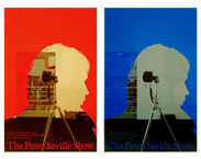 The Peter Saville Show, 2003 Design: Graphic Thought Facility Client: Design Museum, London The Peter Saville Show, 2003 Design: Graphic Thought Facility Client: Design Museum, London
|
 Jasper Morrison
 Some New Items For The Home, Part I, 1988 Design: Jasper Morrison
 Doorhandle Series 1144, 1990 Design: Jasper Morrison Manufacturer: FSB
 Bottle Rack, 1994 Design: Jasper Morrison Manufacturer: Magis
 Moon porcelain dinnerware, 1997 Design: Jasper Morrison Manufacturer: Rosenthal
 Sketch of Op-La tray table, 1998 Design: Jasper Morrison Manufacturer: Alessi
 Tin Family kitchen containers, 1998 Design: Jasper Morrison Manufacturer: Alessi
 Air Chair, 1999 Design: Jasper Morrison Manufacturer: Magis
 Low Pad Chair, 1999 Design: Jasper Morrison Manufacturer: Cappellini
 Coffee Maker, 2004 Design: Jasper Morrison Manufacturer: Rowenta Photography: Christoph Kicherer
 Cutlery, 2004 Design: Jasper Morrison Manufacturer: Alessi
 Cork Family, 2004 Design: Jasper Morrison Manufacturer: Vitra
| Article 2 Jasper Morrison Product + Furniture Designer (1959-) Designing Modern Britain 30 July 2006 - 4 March 2007 JASPER MORRISON is one of today's most influential industrial designers. Born in London, he is renowned for his ascetically elegant, quietly humorous style and has designed everything from a tray-table to a tram system. Anyone who wants to understand Jasper Morrison's work should flick through A World Without Words, the collection of images he compiled in 1988 from his collection of second-hand books and postcards. From one of Buckminster Fuller's Dymaxion houses and Gerald Summers' one piece plywood chair to a fisherman's hut on Hastings' shingly beach, each image illustrates the wit and elegance with which Morrison has revitalised rationalist design. Born in London in 1959, Morrison grew up there and in New York, when his advertising executive father was posted in the US. He studied design at Kingston Polytechnic and the Royal College of Art. In 1986, a year after graduating from the RCA, Morrison opened his Office for Design in London. He cites his early inspirations as his grandfather's study - a light, bright room furnished in the modernist style and an Eileen Gray exhibition he saw at London's Victoria & Albert Museum. During his student years, Morrison became interested in the work of modernist pioneers - such as Buckminster Fuller, Gerald Summers, Jean Prouvé and Le Corbusier - that he discovered in the second-hand books he bought and sold to raise extra cash and later turned into A World Without Words. Another inspiration was the flamboyant furniture he saw at the Memphis movement's first exhibition in Milan in 1981. Morrison later described the experience as: "Just fantastic. Here was proof that none of the old design rules mattered any more." Even as an impecunious young designer, Jasper Morrison was determined to design for industrial production. Rather than making pieces by hand as many young designers do, he scoured London on his Honda 90 moped looking for small industrial workshops which would make up small quantities of objects from ready-made industrial components. His 1984 Flower Pot Table, for instance, was made from a glass circle supported by a stack of ordinary flower pots. "It was the Thatcher era and those small workshops were being forced further and further away from central London," said Morrison. "When I started it was a manageable circuit, but as time went by I felt doomed to ride round in ever-increasing circles as they moved out to the suburbs." Slowly he won industrial commissions from SCP in London; FSB, the German door handle maker; Cappellini, the Italian furniture manufacturer; and Vitra, the Swiss furniture company whose chairman, Rolf Fehlbaum, contacted Morrison after seeing a slide presentation of A World Without Words. In 1988, Morrison designed a room set for the Berlin Design Werkstadt exhibition. Entitled Some New Items For The House, it consisted of chairs, tables, a chaise longue, four walls and a door - all made from plywood. At first glance, the objects looked banal with their simple lines and familiar forms, but closer inspection revealed the quiet intelligence with which Morrison had refined them. The critic, Charles Arthur Boyer, later described Some New Items as aving "crystallised" his design ethos: "to produce everyday objects for everyone's use, make things lighter not heavier, softer not harder, inclusive rather than exclusive, generate energy light and space". Jasper Morrison has pursued those goals ever since. Still working for Vitra and Cappellini, he has now nurtured a strong rapport with other clients including Flos, the Italian lighting company; Magis, the Italian plastic manufacturer; Rosenthal, the German porcelain producer; and Alessi, the Italian metal maker. The perfectly plain 1998 Tin Family steel kitchen tins he produced for Alessi and 1997 Moon tableware for Rosenthal echo the apparent simplicity and underlying subtlety of his New Items and the "archetypal objects" that Morrison searches for constantly. "If I watch a film, I often spend more time looking at the details of objects in the background than keeping up with the plot," he admitted. Always keen to collaborate with fellow designers - such as James Irvine, a friend from the Royal College of Art, and Andreas Brandolini, with whom he formed the Utilism collective in the mid-1980s, Morrison has commissioned products from them and other designers. He and Irvine worked together to compile Cappellini's 1992 Progetto Oggetto range of household objects. Critically, Morrison's clients have also allowed him to experiment with new materials and technologies. The results include his 1999 Low Pad Chair for Cappellini, which was inspired by one of Morrison's favourite mid-20th century chairs - the Danish designer, Poul Kjaerholm's 1956 steel and leather Chair, but used a new method of condensed upholstery to create a comfortable, but durable padded leather seat. Another technical coup is his 1999 Air Chair, an elegant, relatively inexpensive moulded dining chair made from a single piece of plastic using Magis's new gas injection technology. Morrison has tackled more complex commissions: notably by designing a tram system for the city of Hanover in what he described as "an exhausting, but not unenjoyable" two year project. He also collaborated with Herzog & de Meuron, the Swiss architects of London's Tate Modern museum, to furnish its public spaces with his Low Pad Chairs and 1998 Op-lá tray table for Alessi. In 2000, Jasper Morrison departed from his self-imposed rule of concentrating on industrial production by accepting a commission from a museum in the Provençal village of Vallauris to produce a limited edition of ceramics made by local artisans. The result, as Morrison himself admits, shares the sleekness and formal clarity of his industrial designs. Rather than being flattered by his interest, the European craft community was outraged. "Why work with the ancient skills of the Vallauris potters," railed an editorial in one craft magazine, "to make something that looks as if it came from a factory?" In the early 2000s Morrison set up a new studio in Paris and proceeded to divide his working life between there and London. He acquired new clients such as Rowenta, the French household appliances manufacturer for which he is developing a new range of kitchen products including kettles, irons and coffee machines. Morrison also sustained his relationship with established clients by designing new projects for Cappellini, Magis and Vitra. © Design Museum BIOGRAPHY 1959 Born in London. 1979 Studies furniture design at Kingston Polytechnic. 1982 After graduating from Kingston, Morrison enrols on the furniture design course at the Royal College of Art in London. 1986 Opens the Office for Design in London to design products and furniture which, initially, he manufactures himself using ready-made industrial materials and small workshops. 1987 Exhibits in the Documenta 8 exhibition at Kassel, Germany. Develops his furniture designs for production by SCP in the UK and Cappellini in Italy, as well as a door handle for FSB in Germany. 1988 Designs a room set entitled Some New Items For The Home to be exhibited in Berlin and presents a collection of images that have inspired him as the slide show, A World Without Words, in Milan. Vitra offers to manufacture the Ply Chair and other pieces from Some New Items For The Home. 1992 Collaborates with James Irvine to develop the Progetto Oggetto collection of home products for Cappellini from designers such as Marc Newson, Konstantin Grcic and Andreas Brandolini. 1994 Completes the design of Bottle, a plastic bottle rack, for Magis which, for many years, will be his best-selling product. 1995 Awarded a DM500m project, then the biggest light rail project in Europe, to design a new tram system for the German city of Hanover. 1997 Designs the Moon collection of porcelain dinnerware for Rosenthal. 1998 Launches the Op-lá Tray Table and Tin Family for Alessi and the Sim stacking chair for Vitra. 1999 Completes the protoype of the Air Chair, a one piece gas injection-moulded plastic chair for Magis, the Globe lights for Flos and densely upholstered Low Pad and Hi-Pad range of chairs for Vitra. 2000 Tate Modern Museum opens in London with public spaces furnished by Morrison. 2002 Lars Müller publishes a monograph of Morrison’s work, Everything But The Walls. Opens a design studio in Paris. 2003 Completes the development of the ATM desk system for Vitra. 2004 Designs kitchen appliances for Rowenta and cutlery for Alessi. 2005 Completes the development of a collection of furniture for the Vitra At Home and develops products for Muji. Nominated for the Design Museum’s Designer of the Year prize. 2006 Exhibited in Designing Modern Britain 30 July 2006 – 25 February 2007 © Design Museum FURTHER READING Jasper Morrison (ed) A World Without Words, Lars Müller Publishers, 1999 (originally published privately by AA in 1992) Jasper Morrison, Everything But The Walls, Lars Muller, 2002 Jasper Morrison (ed) International Design Yearbook, Abbeville Press, 1999 Charles Arthur Boyer and Federica Zanco, Morrison, Éditions Dis Voir, 1999 Jasper Morrison (ed) A Book of Spoons, Imschoot Uitgevers, 1997 Peter Dormer, Jasper Morrison, Phaidon Press, 1990 Visit Jasper Morrison's website at jaspermorrison.com For more information on British design and architecture go to Design in Britain, the online archive run as a collaboration between the Design Museum and British Council, at designmuseum.org/designinbritain © Design Museum |
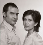
 Mark Porter, Creative Director, The Guardian, 2005
 The Guardian, weekday composite Design: the Guardian © Guardian Newspapers Ltd
 The Guardian front page, 12 September 2005 Design: the Guardian © Guardian Newspapers Ltd
 The Guardian G2, 19 September 2005 Design: the Guardian © Guardian Newspapers Ltd
 The Guardian, Saturday composite Design: the Guardian © Guardian Newspapers Ltd
| Article 3. The Guardian Newspaper (1821-) 25/25 - Celebrating 25 Years of Design 29 March - 22 June 2007 One of the most ambitious projects of 2005, the Guardian redesign has raised the benchmark of editorial design and already led to a significant uplift in Guardian sales. Having decided to shrink its broadsheet format to the new convenient Berliner size, the Guardian’s design team, led by creative director Mark Porter, used the opportunity to initiate a comprehensive and integral overhaul of the entire paper. In an era dominated by instantaneous digital newscasts, the traditional newspaper is under increasing demands to compete for readership and attention. Yet the redesign of the Guardian was more than a reflexive response to its on-screen competitors; the team created a design which combined the most relevant aspects of newspaper tradition with digital technologies and printing processes to make the most of the reduced size, with colour photography, illustration or infographics on every page – a first in national newspaper design in the UK. Although a newspaper has a shelf life of a single day, it is designed anew for each edition to accommodate changing news, advertisements and features. To ensure readability, coherence and continuity the design team implemented a rigorous five-column modular grid structure. A new typeface family – Guardian Egyptian – was commissioned from Christian Schwartz and Paul Barnes to enhance legibility and project a calm, contemporary personality. More direct and visually focused, with an intelligible structure, and minimal distractions for the reader, the overall result is a newspaper designed to interpret daily news with clarity, complementing the high editorial standards the Guardian has celebrated since its first edition in 1821. © Design Museum Q. What were the editorial requirements of the new paper and how does the redesign accommodate these requirements? A.The brief was to create an intelligent serious paper, with a calm tone of voice, which retained a sense of the Guardian’s 200-year history, but was at ease with modern technology and culture. Our response was to design a calm, readable, typographically rigorous paper, which is also colourful and committed to visual journalism through the powerful use of images. Q. Does the new-look Guardian relate to the Guardian’s heritage – what were the elements that you wanted to keep consistent? A. Newspapers, and the way they are read, have changed so much over the last 20 years that it would be pointless to preserve design elements as if they were historic buildings. But it was important to retain the essence of the Guardian design philosophy: an approach to ordering the information, a way of using space and contrast, a love of typographic correctness, and a commitment to photography and illustration. Q. What lessons did you learn looking at newspapers in Britain or abroad when working on the redesign? A. As the project developed, we found that there were no existing models for what we were trying to achieve. We looked at, and admired, innumerable newspapers from all over the world, but most of the lessons we learnt were negative ones – things to avoid if we were to create something really special. Q. Can you explain the origins of the term ‘Berliner’? A. It simply refers to the size of the finished product. The Berliner was one of the three standard paper sizes in continental Europe when newspaper presses were built before the First World War. It caught on in Germany and Switzerland, and made inroads in France and Spain, but never made it across the channel until now. Ironically, there are no longer any Berliner-format newspapers published in Berlin. Q. What were the reasons behind commissioning a new font for the redesign? We tested fonts from many of the world’s top type designers, but in the end we didn’t find any which had all the characteristics we required. We were looking for something traditional yet modern, compact, and available in an enormous range of weights for use at text and display sizes. We found that the only way to achieve this was to create the typeface ourselves. A. How has the newspaper adjusted to using full colour, and has it been successful? Within a week or so the colour felt very natural. It gives us wonderful opportunities with photography, illustration and graphics. But it is also very useful in the typography, to aid navigation, and help distinguish different flavours of content. The biggest danger would have been to go over the top and use too much colour. But by combining certain elements in a few strong colours with black and a range of greys, we found a way of making the paper feel colourful but still intelligent and distinguished. Q. The Guardian is a beautifully tooled paper, but how do you ensure that the readers are helped by the design rather than put off by it? A. Any successful editorial design project puts the reader first, and usability was at the heart of this project. The typefaces were developed for legibility as well as character, and the pages are constructed to make the newspaper as readable and navigable as possible. Of course we care about aesthetics, but only when we are confident about functionality. We do not want readers look at a newspaper and see graphic design; they should see events, people and ideas. designmuseum.org/designinbritain © Design Museum |
 Alejandro Zaera Polo and Farshid Moussavi of Foreign Office Architects Photograph © Valerie Bennett 2004
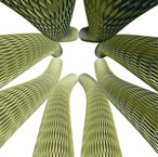
 Yokohama International Port Terminal, Japan, 1995 Design: Foreign Office Architects
 Yokohama International Port Terminal, Japan, 1995 Design: Foreign Office Architects
 Proposal for Ground Zero project, New York, 2003 Design: United Architects for the World's Biggest Architectural Competition
 Auditorium Park at the Forum of International Cultures, Barcelona, 2004 Design: Foreign Office Architects
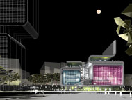 Rendering for the BBC's Music Theatre, London, 2004 Design: Foreign Office Architects
 Rendering for the BBC's Music Theatre, London, 2004 Design: Foreign Office Architects
 Exterior rendering - London 2012 Olympic Stadium, 2004 Design: Foreign Office Architects
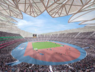 Interior rendering - London 2012 Olympic Stadium, 2004 Design: Foreign Office Architects
 Exterior rendering - Theatre, Torreivieja, Spain, 2005 Design: Foreign Office Architects
 Interior rendering - Theatre, Torreivieja, Spain, 2005 Design: Foreign Office Architects
 Spanish Pavilion, Expo 2005 Design: Foreign Office Architects
| Article 4. Foreign Office Architects Architects (1963- + 1965-) Designing Modern Britain - Design Museum Until 26 November 2006 Projects such as the Yokohama International Port Terminal and the forthcoming BBC Music Centre have established Alejandro Zaera Polo (1963-) and Farshid Moussavi (1965-), the husband and wife co-founders of FOREIGN OFFICE ARCHITECTS, as leaders of the new generation of architects who are defining a new design language to reflect the speed, ambiguity and uncertainty of contemporary life. No one sees the world quite like Foreign Office Architects. Their architecture lifts flaps of skin from the ground, and mutates them in contorted twists, like plastic surgery for the earth’s surface. Buildings become landscape, and landscape buildings, man and nature in one indivisible embrace. Their first major project, the Yokohama International Port Terminal in Japan, stretches the city into the sea, its beach of boardwalks weaving like braids through wooden “dunes”, ducking and diving, inside and out, as you promenade to your ship. When the terminal opened in 2002, it looked like nothing else, guaranteeing star billing for Foreign Office in the international media and yanking them in their late thirties — an unusually tender age in architecture — into the premier league. Next up, taking on old timers like Daniel Libeskind and Norman Foster, FOA were shortlisted in an architectural super-group, United Architects for the World’s Biggest Architectural Competition, that is the Ground Zero project in New York. The most cerebral of the contenders, they were, ergo, least likely to win. Undeterred, FOA sized up against Zaha Hadid and Future Systems in the competition to design the BBC Music Centre in White City, west London. They won with a design — like a slumped sheet of damp wallpaper, freshly peeled from a wall — which promises to be the UK’s most radical building when it opens in 2006. Inside FOA’s office-cum-laboratory-of-architectural-genetic-engineering in east London — a small, cultish hothouse peopled with intense boffins like them — all sorts of other freakish shapes are bubbling up in frothing computers, to be grafted onto the world. First comes Spain, where they have completed the design of an origami police station in Costa Blanca and a seaside park for the Barcelona International Forum of Cultures, which whips concrete and trees up from the land like icing. While Torrevieja sprouts an FOA-designed theatre that looks like a chunk of rock ripped from the ground by an earthquake. Such fluid shapes could pigeonhole FOA with the blobs and angles of so many of their peers. Wrong. The husband and wife founders of FOA – Alejandro Zaera Polo and Farshid Moussavi, hate the “starchitect” system and remain detached from their sudden fame. Their website quotes a newspaper soundbite — “the world’s coolest architects” — in irony. “We reject the icon!” announces Zaera Polo, in mock earnestness. “We love Gehry,” Moussavi butts in, “but our generation can’t operate in the same way”. Once exported round the world, the mass-produced quirkiness of Frank Gehry or Libeskind ends up making everywhere seem the same, all jostling icons yelping “look at me!” — as antiquated as the one-style-fits-all international style of Mies Van Der Rohe, Gropius and Le Corbusier. In its place comes what FOA are after, something in between: localised globalised architecture, if you like. If Gehry’s older generation deconstructed the modernist box, FOA’s generation is more interested in reconstructing, from the landscape upwards. Zaera Polo and Moussavi are not interested in flashy gestures designed to sell cities as Gehry’s Guggenheim Museum has done for the Spanish city of Bilbao. “Our biggest problem today is identity,” says Zaera Polo. “With globalisation, it is difficult to identify exactly who we are and where we fit in space.” “We are all, to a certain extent, foreign these days,” adds Moussavi. “It’s a modern condition.” Hence the company name. She is Iranian, he Spanish, and they travel constantly. The architectural symptoms of globalisation are non-place, branded junkspace, the tendency for everywhere to end up looking the same — freeways and malls and Dunkin Donuts. The solution? “Something which helps us identify ourselves in the melee of globalisation,” that references place, landscape and history — especially in marginalised spots like London’s Lea Valley — with complexity and subtlety, without veering towards the kitsch of 1980s post-modernism. That’s where it gets tough. The FOA duo have big brains and conduct conversations leaping from Stockhausen to calculus. The pair fell in love in Harvard University Library. On Christmas Day. They were kindred spirits searching for the same goal, to yank the avant garde out of the ivory towers of academia, and set it to work building this new landscape. Or as they put it, ensuring that theory and practice are “no longer understood either in opposition or in a complementary, dialectical relationship, but rather as a complex continuum in which both forms of knowledge operate as devices capable of effectively transforming reality”. Got that? Trying to find the words to explain what this localised globalised architecture might be to lay mortals is, confesses Zaera Polo with a sad shake of the head, “very difficult”. So they use a lot of metaphors, their favourites are ecological. “Each building is like a species grown for a specific ecosystem, an antidote to homogenising globalisation,” notes Zaera Polo. In other words, FOA does not stamp one style wherever, whatever. They take root. “We territorialise ourselves, try to become locals in each place,” with on-site offices staffed by local talent sniffing out the genius loci. The FOA exhibition at the Institute of Contemporary Arts in London in 2004 was structured around a giant “genetic tree”, showing the evolution of their species as the “seeds” of ideas take root in particular places. “We try to let the building grow by itself,” says Zaera Polo, in “a riff” between the computer — “a tool like any other” — and the qualities of the place — from the budget to the exact curve of a particular slope. In their scenario, the architect simply “edits” or “conducts” what emerges, no longer playing the heroic artist, but a midwife delivering a latent form, which was buried in the landscape all along. “It’s like a winemaker,” suggests Zaera Polo. “You have a grape. You know that if you go to Chile or Napa Valley a particular grape will grow in ways that will produce different flavours.” FOA’s proposed designs as part of the architectural team behind London’s 2012 Olympic bid are an apt illustration. The Olympics is the ultimate globalised brand which, every four years, descends on one particular lucky – or unlucky – place. Usually icons and monuments are built, or an Atlanta Olympics corporate circus passes through town. FOA’s Olympics, though, will be “an antidote to the usual sanitised, branded theme park that could-be-anywhere-Olympics,” stresses Zaera Polo, something that “distills the character, crystallises the ambience” of the site, east London’s rundown Lea Valley. “We don’t want to clean it up, cover it in concrete, and put a few white elephants on a platform,” says Zaera Polo. “We want to grow the Olympics from the bottom up”. And, adds Moussavi, “capture some of the “the gruff, east London street culture of a hundred languages, the unexpected, the quirky, the weird” that makes London’s hybridised buzz the envy of every metropolitan rival. To most of its inhabitants, Lea Valley is a post-industrial junk shop of viaducts, scrapyards and warehouses, cobbled together with rampant buddleia. But to Alejandro Zaera Polo and Farshid Moussavi, it is paradise, an exciting man-machine, eco-techno organism from which to conjure up astonishing architectural shapes. The challenge they have set themselves is the same that has confronted the British since Carlyle and Ruskin, when industrial revolution and empire started to churn up the earth by blurring geographic boundaries. How to find identity in a world of flux? The solution is the same: “the sublime,” says Zaera Polo, “a physically exciting form to project the things around us to a higher level”. No different from the Renaissance. Except that our age is not fixed and knowable, but shifting and nonlinear; our spheres are not ordered but chaotic; our universe is not closed but expanding; our human is no Renaissance man, but a mongrel, with many slippery identities. Our landscape must follow suit, with waves, curves, loops and folds twisting, contorting and melding like, well, like another metaphor, the classic one. “We want our architecture to be like entering a piece of music,” concludes Zaera Polo. “Music is about spatialising and distributing forms. It surrounds you.” But don’t expect Mozart. “We listen to techno.” BIOGRAPHY 1963 Alejandro Zaera Polo is born in Madrid, Spain 1965 Farshid Moussavi is born in Shiraz, Iran 1981 Zaera Polo starts seven years of studies at the ETS of Architecture in Madrid 1983 Moussavi enrols as a student at the University of Dundee 1987 After working for a year at the Renzo Piano Building Workshop in Genoa, Moussavi studies at the Bartlett School of Architecture, University College London 1989 While studying for their masters degrees in architecture at Harvard Design School, Zaera Polo and Moussavi meet. 1991 Having graduated from Harvard they work at Rem Koolhaas’s Office for Metropolitan Architecture in Rotterdam. 1993 Alejandro Zaera Polo and Farshid Moussavi marry, and found Foreign Office Architects in London, where they have moved to teach at the Architectural Association. Later they also teach at the Universities of Princeton, UCLA and Columbia in the US. 1995 FOA wins the competition to design the Yokohama International Port Terminal in Japan. They are the youngest architects to win such a prestigious international competition since Richard Rogers and Renzo Piano won the commission to design Centre Georges Pompidou over 20 years before. 1998 Completion of FOA’s first built project, the Belgo restaurant on Ladbroke Grove in London. 1999 FOA moves to Yokohama to oversee construction of the ferry terminal 2002 Completion of the Yokohama International Port Terminal. FOA is chosen by the British Council to represent the UK in the British Pavilion at the Venice Architecture Biennale. Appointment of Zaera Polo as dean of the Berlage Institute in Rotterdam, and Moussavi as professor at the Academy of Fine Arts, Vienna. 2003 Submit a proposal for the Ground Zero project in New York as part of the architectural super-group United Architects for the World’s Biggest Architectural Competition. The proposal is not successful. 2004 Opening of the Auditorium Park at the Forum of International Cultures, Barcelona. Exhibition of FOA’s architecture at the Institute of Contemporary Arts in London. Appointed as architects for the London 2012 Olympic bid with Allies & Morrison, HOK and EDAW. FOA wins the competition to design the BBC’s new Music Theatre at White City in London. 2005 Completion of a theatre in Torreivieja, Spain. © Design Museum + British Council designmuseum.org/designinbritain |
Не нашли, что искали? Воспользуйтесь поиском: