ТОР 5 статей:
Методические подходы к анализу финансового состояния предприятия
Проблема периодизации русской литературы ХХ века. Краткая характеристика второй половины ХХ века
Характеристика шлифовальных кругов и ее маркировка
Служебные части речи. Предлог. Союз. Частицы
КАТЕГОРИИ:
- Археология
- Архитектура
- Астрономия
- Аудит
- Биология
- Ботаника
- Бухгалтерский учёт
- Войное дело
- Генетика
- География
- Геология
- Дизайн
- Искусство
- История
- Кино
- Кулинария
- Культура
- Литература
- Математика
- Медицина
- Металлургия
- Мифология
- Музыка
- Психология
- Религия
- Спорт
- Строительство
- Техника
- Транспорт
- Туризм
- Усадьба
- Физика
- Фотография
- Химия
- Экология
- Электричество
- Электроника
- Энергетика
Articles and Essays 9 страница


 Timorous Beasties
 The Arches Theatre, Glasgow, 1999 Design: Timorous Beasties and One Foot Taller
 Strata Bar, Glasgow, 1999 Design: Timorous Beasties and One Foot Taller
 Strata Bar, Glasgow, 1999 Design: Timorous Beasties and One Foot Taller
 Philip Treacy haute couture, Paris, 2000 Fabric design: Timorous Beasties
 Philip Treacy haute couture, Paris, 2000 Fabric design: Timorous Beasties
 Chair, Retrouvius Project, 2003 Design: Timorous Beasties
 Fabric, Retrouvius Project, 2003 Design: Timorous
Beasties
Fabric, Retrouvius Project, 2003 Design: Timorous
Beasties  Thistle motif, Retrouvius Project, 2003 Design: Timorous Beasties
 Art Nouveau Fabric, 2004 Design: Timorous Beasties
 Glasgow Toile, 2004 Design: Timorous Beasties
 Timorous Beasties' Shop, Glasgow, 2004
| Article 27. Timorous Beasties Textile Designers (1967- + 1967-) Noted for its surreal and provocative textiles and wallpapers, the design studio Timorous Beasties was founded in Glasgow in 1990 by Alistair McAuley and Paul Simmons, who had met while studying textile design at Glasgow School of Art. Timorous Beasties was shortlisted for the Designer of the Year prize in 2005. By depicting uncompromisingly contemporary images on traditional textiles and wallpapers, Timorous Beasties has defined an iconoclastic style of design once described as “William Morris on acid.” Typical is the Glasgow Toile. At first glance it looks like one of the magnificent vistas portrayed on early 1800s Toile de Jouy wallpaper, but closer inspection reveals a nightmarish vision of contemporary Glasgow where crack addicts, prostitutes and the homeless are depicted against a forbidding backdrop of dilapidated tower blocks and scavenging seagulls. Timorous Beasties was founded in Glasgow in 1990 by Alistair McAuley, born in Duntocher in 1967, and Paul Simmons, born in Brighton in 1967, who met as students at Glasgow School of Art. After beginning by designing fabrics and wallpapers for production by other companies, Timorous Beasties then started to manufacture its designs and recently opened a shop on the Great Western Road in Glasgow. McAuley and Simmons also execute special commissions, such as fabrics for Philip Treacy’s hats and for the interiors of the Arches Theatre in Glasgow and 50 Piccadilly, a London casino. As their working practise as designer-makers has progressed, Timorous Beasties have become increasingly experimental in their approach to both hand-printing and machine production. These changes are reflected in their evolving aesthetic: from early wayward interpretations of naturalistic images of insects, plants and fish; to a searingly contemporary graphic style which, as Glasgow Toile illustrates, explores social and political issues. Q. How did you each become interested in design? A. Alistair: From when I was very young I was always interested in drawing and making things, I find it difficult to pinpoint any particular thing or time which started it as it always seemed to be there, however it took me until art school to get to grips with possible careers combining everything that I could identify with. A. Paul: I always loved art and design at school. Once I was at art school it was a process of elimination. Q. When did you meet, and why did you decide to work together? A. We met and studied together at Glasgow School of Art from 1984 but only decided to work together after we graduated in 1988. Our fabrics attracted a lot of interest as our styles seemed to complement each other and we shared many common ideas about surface design and the market environment. We both wanted our designs to be produced but more importantly we wanted to be able to control all aspects of production. Setting up our own design and manufacturing studio was the only way forward. Q. Which of your early projects were most important in establishing you as designers? A. In the beginning we seemed to spend most of our time working for other textile companies, like Sahco Hesslein, Mantero, Osborne & Little and Dedar. Our first public project was commissioned by Graven Images, the design consultancy, for a bar in Glasgow called The Living Room. We used a series of insects and floral motifs printed onto paper which was engineered to fit each wall, and some drapes designed specifically for that place. Q. What were your objectives at the time? A. To produce unusual and beautiful fabrics, wallpapers and products which were sensitive to the interior they were designed for. Q. How has your work evolved since then – both in terms of your practice and objectives? A. Our objectives remain basically the same, but our practice has become more involved in designing for experimental techniques both in hand-printing and machine production. Q. Can you describe your working practise, for example, the process of developing a new project? A. The process of developing a new project can happen in many ways. Sometimes we develop work or a technique through a commission. This comes through close liaison with a client in response to their criteria and the environment. At other times ideas develop and change into something we had not anticipated in the production process, but we always design with production in mind. Sometimes we have an idea that develops slowly sampling onto various fabrics or papers to achieve the quality we want. Q. Why did you decide to manufacture textiles as well as designing them? How has becoming designer-makers changed your approach to design and way of working? A. We wanted to be able to hold up the results, and be independent from what the market wanted. Q. Do you see your work as part of a tradition? A. One could say we are part of a print tradition; we are one of very few companies which still designs and manufactures under one roof. Silkscreen printing is a relatively new technique, but the format falls into a kind of block printing style, which makes our style of printing more versatile than the norm. Maybe we could call it a modern tradition. A lot of our work features images that can look traditional. This comes from a love of certain traditional elements, like academic drawing, use of complicated repeats, and the hand printed quality of inks. Q. How have advances in technology affected your work? A. Technology has and will always affect the way people work, it does not necessarily change the work itself. We can handle a much larger workload now with technology than we could ten years ago; email has enabled us to deal easily with international clients and given us the ability to exchange ideas more freely. Computers are just another tool, we still hand draw a lot, but are now able to scan in the drawings, enlarge and reduce them. Previously we would have had to blow up and stick images together on a photocopier; previous to that to project them onto a wall and trace; and previous to that to scale up using a grid. New technologies such as digital printing onto fabric are also being used a lot more, but the feel and quality is different, for example you can’t print metallic or opaque ink. At the moment we are experimenting with high and low tech processes, by having some parts of a design digitally produced whilst hand printing onto the back of the fabric to achieve a completely different quality. Q. Who or what inspires your work? A. Inspiration is usually very indirect, it can take lots of different shapes and forms which can also be influenced by timing. To name but a few: Dutch design, Josef Frank, William Morris, Joseph Beuys, Paul Klee, Leonardo, Picasso, Ridley Scott, Tom Kirk, Chuck Mitchell, Italian motorcycles, Jake and Dinos Chapman, Ricky Gervais, Mona Hatoum and so on. Q. Which of your design projects have you found most satisfying – and why? A. Opening the shop. Why? Because it took so long. Q. How did the Glasgow Toile project come about? A. The Glasgow Toile happened as a result of many things, firstly a love of the old toiles produced in pre-revolutionary France in the small town of Jouey in the 1770s. Having designed a few commissioned toiles in the past, one for the Sheriff of Nottingham, and another for a client who loved African Elephants, we believed the compromise had been too great, but had learned a lot about how toiles are designed and put together. The Glasgow Toile was a technical challenge, in order to separate the drawings like the originals, producing extra depth and texture by overlapping and leaving gaps in the artwork to create more tones when the inks overlap one another, and also by joining the scenes together with horizontal lines. Q. The social and political sub-text to the Glasgow Toile marks a departure from your previous work. Why did you choose to explore those themes? A. The imagery in the original French 18th century toiles was quite sinister. They depicted scenes which were then contemporary, but we now see as traditional. Some scenes showed the factory at Jouey, and others rural scenes of workers relaxing, drinking, dancing, and womanising. So we did not actually change much in the Glasgow Toile; a glass of wine became a can of super lager, a pipe became a rollie, and an old man sitting on a stool in a rural scene became a tramp on a park bench. Some of the scenes are from an area of Glasgow where we lived and worked for a big part of our lives. The scenes are sinister, funny and moral. A junkie shoots up in a graveyard – the graveyard is a famous Glasgow landmark, called the Necropolis, where junkies go. The moral tale being that if you shoot up, you will literally end up in a graveyard. A young man pees against a tree in a park. A tramp takes a swig from a can of beer. The moral here is that if you start misbehaving early in life you may end up in the park later on. All this is happening as the Glasgow University Tower looms above like a fairy tale castle. Other landmarks are the Charles Rennie Mackintosh Church situated in Maryhill, a poor area of Glasgow where we used to have a studio, while Norman Foster’s Armadillo building represents the changes along the Clyde, a once booming industrial port. The urban landscape in many UK cities seems to change all the time. Modern buildings have become icons that give us a strong sense of identity, therefore the Glasgow Toile seemed a perfect expression of where we were coming from. To sum things up, we do love some of the traditional designs from the past, but it’s great fun to give them a new angle, to make them speak to us in the present. timorousbeasties.com; designmuseum.org/designinbritain |
 Amelia Noble (left) and Frith Kerr (right)
 Channel 4 Rivermap leaflet, 1999 Design: Kerr Noble Client: General Assembly
 'Bun Bun' and 'Tony Face' Seaside Suicide posters, 2001 Design: Kerr Noble Illustration: Ian Wright Client: Tony Kaye
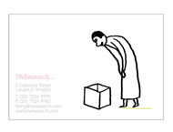 Identity for TWResearch, 2001 Design: Kerr Noble Illustration: Paul Davis Client: TWResearch
 Lost But Not Forgotten magazine, 2002 Design + Production: Kerr Noble
 Exhibition graphics for Gio Ponti
 Packaging for Liberty food range, 2003 Design: Kerr Noble Illustration: James Lambert Client: Liberty
 No More Rules - Graphic Design and Postmodernism by Rick Poynor, 2003 Design: Kerr Noble Image: Edward Fella Client: Laurence King Publishing
 Import Export catalogue, 2004 Design: Kerr Noble Photography: Amber Rowlands Client: British Council
 Identity for Melrose & Morgan, 2004 Design: Kerr Noble Client: Melrose & Morgan
 Exhibition graphics for Beauty and the Beast - New Swedish Design, 2005 Design: Kerr Noble Client: Crafts Council, London
 Tomoko Takahashi catalogue, 2005 Design: Kerr Noble Cover photography: Stephen White Client: Serpentine Gallery, London
| Article 28. Kerr Noble Graphic Designers The European Design Show Design Museum Touring Exhibition After meeting as graphic design students at the Royal College of Art, Frith Kerr and Amelia Noble started to work together as KERR NOBLE on cultural projects for Artangel, the Architecture Foundation and the Design Museum and commercial work for clients such as Liberty. By combining typographic rigour with illustrations and hand-crafted detailing, Frith Kerr and Amelia Noble of the London-based design studio Kerr Noble succeed in enlivening and humanising graphic design while enhancing – rather than detracting from – its functional role as a means of communicating information. Having met as students at the Royal College of Art in London, Kerr and Noble, who originally studied at Camberwell and Central St Martins respectively, set up their partnership after graduating in 1997. They have since worked in the Clerkenwell district of London. Many of their projects are for cultural organisations such as the Natural History Museum, Architecture Foundation, Artangel Crafts Council and Design Museum, for which they designed graphics for the Gio Ponti, Hella Jongerius and Constance Spry exhibitions. Kerr Noble has also produced graphics for print and moving image for the iconoclastic film maker Tony Kaye since 1999 and developed a range of food packaging for the department store Liberty. Visit Kerr Noble's website at kerrnoble.com © Design Museum Q. You met each other while studying at the Royal College of Art in the mid 1990s. Can you remember the qualities that encouraged you to form a partnership? AN. At the RCA students are always involved in large crits and competitions which involve presenting work to tutors and fellow students — it was during our crits that I first remember admiring Frith’s work. We jointly won a project competition and had to work together, which worked out really well. We discovered we shared a similar philosophy of concept-based work, but had very different complementary skills. Having worked together all hours on this project and enjoyed it, it seemed like a fairly obvious progression to set up a studio together. FK. When I arrived at the RCA my friend Lynwen and I would sit by and watch a huge clan of Central Saint Martin’s girls at their desks. Somehow Camberwell College and Central Saint Martin’s were always the north and south divide. So it was with great suspicion that I spotted the work Amelia was doing. I thought she was completely the opposite to me and the same all at the same time. I still do. In fact when we disagree we are usually in agreement, but it takes us a while to work it out. Q. What are your respective design influences? What first drew you to graphic design? AN. I grew up in the middle of the countryside and spent most of my time entertaining myself writing poems or songs, taking photographs, crashing about on a borrowed drum set or playing the piano. My sister did a lot of drawing and painting and my other sister often joined me in my imaginary band. Graphic design seemed like the perfect way to avoid selecting any one of these things – it includes all of them and more. Both my parents are painters and they suggested that graphic design might be a flexible creative subject and a little more lucrative for me than painting. FK. My father is a graphic designer and my mother was a fashion illustrator at the time. I grew up with amazing fashion, photography and drawing books and pictures in the house but they didn’t want me to be a graphic designer – they would have loved me to have gone to university to study something ‘proper’. I didn’t think that I wanted to do graphic design or to be an Illustrator either, but I loved art at school. I persuaded them to let me do a foundation course before university to see and ended up choosing graphic design. At this time it was very exciting to me that I didn’t need to distinguish between drawing and writing and design. It was all the same – and it still is. Q. Do you feel that your education (design or otherwise) influenced the way you work now? AN. I went to a boarding school in Kent in the middle of a forest. I think the work ethic there has stuck with me. On top of all the homework, we had between 4 and 6.30pm (before prep time) to learn other skills. I did young persons enterprise, ballet, piano, drums and choir on various evenings throughout the week—so I was obviously a very studious pupil. FK. Definitely. I loved school – such a goody two shoes! And I loved reading. I think that underpins my love of research – I’m much happier reading and thinking and talking. Doing and detail I like but not as much! Beyond school I think studying at Camberwell was very exciting and difficult. It made a big difference in my attitude to what graphic design could be. Q. Do you teach? FK. Amelia used to teach at Central Saint Martin’s and I used to teach at Camberwell but we found in the end it was too hard trying to divide our time between the studio and college. Through teaching we made great friends and collaborators. Q. You often say that your work is based on your research. Can you describe how you translate your research into commercial work? AN. When we say ‘based on research’, we mean that we like to have time to explore the subject matter of a brief, we like initiating journeys to find new ways of looking at something. It is this gathering of information and lateral thinking which gives us the foundation to start designing. We never know where we might end up visually. That is the exciting thing. FK. When we worked on Beauty and the Beast—a show about Swedish design for the Crafts Council in London— we decided that the last thing we wanted to do was look at Swedish design. We had a month to present concepts, and we spent three and half weeks researching and thinking about Sweden – its people, its habits, its weather. It is quite hard to trust this process. Sometimes it takes a long time and you don’t know where you are going. Most Swedes have a second home in forests, as there are many forests there. Tree cutting is a big part of their lives, land and landscape. The font that we eventually developed, although it is completely abstract, came from the idea of cutting simple log shapes with an axe or saw. I don’t think that we could have got to that solution in any other way. Q. You have collaborated with illustrators on several projects. What prompts you to introduce an element of the hand-drawn to your work? FK. The immediacy of the hand-drawn or hand-applied is exciting. It has been great collaborating with people like Paul Davis, Ian Wright and James Lambert. I don’t think it is only the hand-drawn aesthetic that we are drawn to, but also the idea of something that is not perfect. When we were working on packaging for Liberty, the department store, much of the finishing on the products was done by hand because we were excited about this idea of ‘in-built’ imperfection. Q. Among your projects is the self-published magazine Lost But Not Forgotten. What led to this publication and how will the project develop? AN. This came about in a funny way. We were nominated for an editorial prize in Creative Review’s Creative Futures awards, but had done very little editorial design. We decided to set ourselves a project where we would collaborate with people whose work we liked but hadn’t worked with before. We asked everybody to meet us at Highgate Cemetery one autumn afternoon. Lost But Not Forgotten was a collection of their responses to the visit. Frith and I edited, designed and produced a magazine. We are now working on the second issue, entitled Modern Manners. Q. You now work directly with artists, for example in your catalogue for Tomoko Takahashi. Is the artist/designer relationship very different to that with other clients? FK. Tomoko was living in the Serpentine Gallery in London at the time, sleeping in the day and working through the night on her installation. We glimpsed her a couple of times but worked very closely with the Serpentine team to produce her catalogue. Our work is concept-led which translates very well when working with artists, but doesn’t seem to be very different to how we work with our commercial clients. When Artangel asked us to work on the publicity and signage for Kutlug Ataman’s Kuba project, we proposed a conceptual approach which was respectful of his concept – by mirroring the idea but not mimicking the art – but also communicated the heart of the project across all media, to a broad audience. Q. Who would be your ideal client? How would you characterise the perfect relationship between designer and client? FK. A cross between Miuccia Prada and David Attenborough! AN. The perfect relationship between client and designer is one where you understand one another, but you can also teach one another things. An exchange. It’s all about going on an adventure, to find something unexpected and creating a design or visual language from that. Q. What is your favourite piece of your own work? AN. This is a really difficult question actually… but some of my favourites are our work for Channel 4 and the Gio Ponti typeface and Gio Ponti Register of Works for the Design Museum. I also liked the process of developing the Lost But Not Found font and how it came about. FK. It is difficult. My favourites include: the Lunar Keypad for the Natural History Museum, the Gio Ponti Register of Works for the Design Museum, Tony Kaye’s Face poster, our work for Channel 4 and the Beauty and the Beast font for the Crafts Council. Q. What is your favourite piece of graphic design in general? AN. I don’t really have a favourite piece of graphic design, but I love these Inuit Coastline Relief Carvings which are three-dimensional sculptural maps of the coastline. They embody what I think graphic design is and can be. FK. When I was a teenager and into reading, I would borrow or steal my mother’s books and I completely fell in love with Penguin’s series of Milan Kundera novels designed by Mike Dempsey and Ken Carroll, and illustrated by Andrzej Klimowski. I loved those books and Ioved the covers. It doesn’t get better than that. Years later looking back, I still love them. kerrnoble.com; designmuseum.org/designinbritain; © Design Museum |
 Derek Birdall
 Promotional material for the Lotus Car Company, 1961 Design: Derek Birdsall
 Windscreen de-icer pack for Pirelli, 1962 Design: Derek Birdsall
 Mailer for photographer Hans Feurer, 1966 Design: Derek Birdsall
 Calendar illustrating love poetry for Pirelli, 1968 Design: Derek Birdsall
 Conference delegates pack for Alliance Graphique Internationale, 1969 Design: Derek Birdsall
 Book cover for Penguin, 1969 Design: Derek Birdsall
 Book cover for Penguin Education series, 1971 Design: Derek Birdsall
 The Independent Magazine, 1989 Design: Derek Birdsall
 Detail: Leaflet for IBM and the Design Council, 1993 Design: Derek Birdsall
 Common Worship, Services and Prayers for the Church of England, 2000 Design: Derek Birdsall
 Notes on Book Design for Yale University Press, 2004 Design: Derek Birdsall
| Article 29. Derek Birdsall Graphic Designer (1934-) As a child, DEREK BIRDSALL (1934-) loved stationery shops: infinite stacks and reams of paper, pads, notebooks and ledgers; instruments for writing, duplicating and erasing; virgin ink and paper in endless configurations of possibility. He speculates that this feeling was inherited from his grandfather, a clerk in a chemical works, and by Birdsall’s admission, a fountain-pen fetishist. Birdsall’s first commercial work was hand-drawn and lettered posters for the local cricket club, for which he earned sixpence a week for six posters, including installation and drawing pins. Fifty years later, and still an obsessive pad collector, he has developed a grid-system of revelatory simplicity for book design based on the standard graph paper measured in millimetres that is available from just about any stationer in Europe. Derek Birdsall hated school but his beautiful handwriting was noticed by his grammar school art teacher who recommended art school. He joined Wakefield College of Art at the age of 15 to study for the Intermediate Examination, which is the equivalent of today’s Foundation qualification for an undergraduate degree in art. Faced with a choice between Lithography and Lettering, Birdsall chose the latter. Upon discovering his young age, the Wakefield authorities insisted he stay for three years, during which he dabbled in letterpress, bought a printing press of his own and began to manufacture cards for local businesses with type “borrowed” from the college’s composing room. In 1952 he won a scholarship to the Central School of Art and Design in London. At Central, Birdsall came under the influence of Anthony Froshaug, who – alongside Herbert Spencer and Edward Wright – taught his students the difference between beautiful lettering and typography proper, with its pre-eminent concerns of clarity, directness and, above all, textual legibility. Birdsall recalls how the 1951 Festival of Britain had been “typographically Victorian”, but also how through Froshaug and his teaching colleagues, and through magazines like the Swiss printing trade journal SGM, the legacy of Jan Tshichold was beginning to take hold in Britain in asymmetric print designs of modernist simplicity and decorative restraint. When Birdsall left Central, printers were still the principal source of freelance work, but a few publishers and advertising agencies were beginning to acquire typographic designers “of modernist approach”. After two years of National Service in the Royal Army Ordinance Corps Printing Unit in Cyprus, Birdsall’s first design job was for the printer Balding & Mansell in 1957: a series of leaflets to go with opera LP records with the text set in standard Garamond and “indulgent” titling for Salome in Legend and Aida in Gothic Shaded. The style owed much to Froshaug’s own typographic sensibility which Birdsall describes as “a sense of poetry; modernism with a delicate touch”. While Froshaug loved Gill Sans, for example, he was aware of and deployed the contrapuntal merits of other typefaces. By contrast, some other hardline modernist typography departments supplied only Helvetica to their students. In 1957 Birdsall was offered a job at the very forward-looking advertising agency Crawfords under the direction of Tom Wolsely, designing the typographic lines on print advertisements. He declined, preferring to remain freelance. This was the beginning of an era of British design that Birdsall describes now as “great and classic”, the 1960s and 70s. He began to be aware of American art directors like George Lois and Henry Wolf and to observe vividly how the worlds of advertising and editorial design were constantly outshining each other and upping the ante set by the other. In 1959 Birdsall formed BDMW with George Daulby, James Mortimer and George Mayhew, simultaneously with the other epoch-defining design agency Fletcher, Forbes & Gill. During the next eight years at BDMW Birdsall acquired a reputation as the “emergency art director”, multifariously commissioning and art-directing photography and illustration as well as designing typography and layouts for various magazines. In 1967 he started his own studio, Omnific! He continued to design jackets for Penguin books, including a complete re-style of the Education series in 1970; art-directed Town and Nova magazines for short periods as well as Willy Fleckhaus’s now legendary Twen; designed advertisements and literature for Lotus cars and Mobil Oil in New York; and produced the series of Pirelli calendars – for the first time not featuring tyres – which are still the work by which he is best known to many. During the same period he was appointed to a lectureship at the London College of Printing and taught at Maidstone College of Art, always playing modern jazz during class as long as it was allowed. Birdsall began to get fascinated by meeting writers and still admits no greater thrill than getting a telephone call from an author who wants him to design his book or its jacket. Gradually, from the early 1970s, he became known above all as a book designer. The Penguin covers of the 1960s and 70s close to art-direction – just the type on the Penguin covers of the 1960s and 70s, for example, is brilliantly graphic in itself, with or without illustration. During this period he also became a temporary member of Monty Python as remuneration for designing a landmark book for them. It was followed by two decades of grand and beautiful illustrated books for great world institutions including Yale Center for British Art, Tate, the V&A and the British Council – catalogues of art and architecture and artefacts – with elegant type and illustrative material exquisitely placed and calibrated in scale. He returned briefly to editorial design and art direction in the late 1980s with dramatic and elegant redesigns for the Independent and Sunday Telegraph magazines. Birdsall’s evolution as a virtuoso book designer is the clearest indication of the principle of transparency that he attaches to design. He is troubled by what he calls the notion of “the designer as It” – as an egocentric expressionist (or Author as current discourse has it) – which is unsatisfying in practice, ephemeral in effect and ultimately even “tragic”. The preface to his 2004 book notes on book design – part reflective treatise, part technical manual – introduces “simply the decent setting of type and the intelligent layout of pictures based on a rigorous study of content”. This is the organising sensibility of all great graphic designers, who manage to contrive tension and sublimity within the exercise of reason. His innocuous recommendation is also, curiously enough, shared by avant-garde mentors of today including Rem Koolhaas and John Thackara: the sense that design needs to be re-conceived as the organisation of what already exists, rather than as the deliberate creation of novelty. Birdsall’s designs are not born of mysterious inspiration but “based on simple, discoverable facts about the books themselves”. In 2000 Birdsall’s redesign of the Book of Common Worship was published by the Church of England. It is an awesomely demanding feat of typographic organisation befitting a character who – notwithstanding our popular image of the fiery, irrational creative type – has recently filed all his thoughts and notes since the 1950s on A6 index cards. He has prevailed in a studio at the bottom of his garden, with few assistants and minimal technology, through an era of graphically reductive power-branding and baroque adventures in screen-based design, as a typographer with – above all else – respect for the image that words alone can create. BIOGRAPHY 1934 Born in Wakefield, Yorkshire 1947 First freelance commission at the age of 13: hand-painted posters for Knottingley Cricket Club 1949 Enters Wakefield College of Art 1952 Wins scholarship to Central School of Arts and Crafts in London. Fails diploma on account of external assessor’s appraisal: “not enough work and type too small” 1955 Enlists for National Service on ROAC printing unit in Cyprus; demobbed in 1957 while in same week receiving first commercial commission from Balding & Mansell printers in London. Balding & Mansell continue to print his work as a supplier 1960 Birdsall designs his first Penguin covers 1961 Designs literature for Lotus Cars and for Pirelli, including three of the now famous Calendars; also designs packaging for Morphy Richards (domestic appliances) and Dorothy Gray (cosmetics) 1960-70 Art-directs magazines including Town, Nova and Twen 1963 Elected to the Alliance Graphique Internationale 1970 Re-styles Penguin Education series; also commissioned by Mobil Oil to design Pegasus, their magazine for world-wide distribution which eventually ran for 20 years in six languages. The commission was followed by several print advertising briefs and books for Mobil companies all over the world 1977 Designs Monty Python book for a fee comprising temporary membership of the comedy group and 1/7 of the royalties 1980-91 Designs several major art catalogues for Yale University Press, including Treasure Houses of Britain at the National Gallery in Washington, DC in 1985 and Rembrandt and His Workshop at the Rijksmuseum in Amsterdam in 1991. Also designs catalogues for George Stubbs at the Tate Gallery (1984), Margaret Bourke-White at the RCA (1990), Henry Moore for the British Council in New Delhi (1987) and the Duff Cooper Library for the British Embassy in Paris in 1997. 1983 Made Royal Designer for Industry (RDI) 1988-92 Returns temporarily to magazine design and art-direction, designing The Independent Magazine and the first issue of the Sunday Telegraph Magazine; both are very successful in terms of circulation increase. Also devises an in-flight magazine for IBM Europe, 1992 Now 2000 Designs The Albert Memorial, a book on the restoration of the eponymous monument, published the Paul Mellon Centre in London. Against stiff competition wins the commission for a new edition of Common Worship, the book of liturgical forms and services belonging to the Church of England. 2004 Designs a set of commemorative stamps for the Royal Society of Arts 250th anniversary and Yale publishes his own Notes on Book Design 2005 Awarded Prince Philip Designers Prize © Design Museum + British Council designmuseum.org |
Не нашли, что искали? Воспользуйтесь поиском: