ТОР 5 статей:
Методические подходы к анализу финансового состояния предприятия
Проблема периодизации русской литературы ХХ века. Краткая характеристика второй половины ХХ века
Характеристика шлифовальных кругов и ее маркировка
Служебные части речи. Предлог. Союз. Частицы
КАТЕГОРИИ:
- Археология
- Архитектура
- Астрономия
- Аудит
- Биология
- Ботаника
- Бухгалтерский учёт
- Войное дело
- Генетика
- География
- Геология
- Дизайн
- Искусство
- История
- Кино
- Кулинария
- Культура
- Литература
- Математика
- Медицина
- Металлургия
- Мифология
- Музыка
- Психология
- Религия
- Спорт
- Строительство
- Техника
- Транспорт
- Туризм
- Усадьба
- Физика
- Фотография
- Химия
- Экология
- Электричество
- Электроника
- Энергетика
Articles and Essays 5 страница


 Robert Brownjohn at the Institute of Design, Chicago, c.1945 © Eliza Brownjohn
 Watching Words Move, 1959 Experimental typography booklet Brownjohn, Chermayeff & Geismar © Eliza Brownjohn
 Watching Words Move, 1959 Experimental typography booklet Brownjohn, Chermayeff & Geismar © Eliza Brownjohn
 Robert Brownjohn and Donna Walters © Eliza Brownjohn
 Obsession and Fantasy, 1963 Poster for the Robert Fraser Gallery, London Robert Brownjohn © Eliza Brownjohn
 Brownjohn and Margaret Nolan on the set of Goldfinger, London 1964 Photograph by Herbert Spencer © Mafalda Spencer
 The making of the Goldfinger title sequence, London 1964 Photograph by Herbert Spencer © Mafalda Spencer
 Rolling Stones, Let It Bleed, 1969 Album cover – front Photography by Don McAllester Robert Brownjohn © ABKCO Music & Records, Inc
 Rolling Stones, Let It Bleed, 1969 Album cover – back Photography by Don McAllester Robert Brownjohn © ABKCO Music & Records, Inc
 Stationery for Michael Cooper Robert Brownjohn
 Poster for Nagata & Brownjohn Ltd., 1960s Robert Brownjohn
 Poster for the New York Peace Campaign, 1969 Robert Brownjohn © Eliza Brownjohn
| Article 14. Robert Brownjohn Graphic Designer (1925-1970) 15 October 2005 to 26 February 2006 Design Museum Exhibition Combining audacious imagery with ingenious typography, illustration and found objects, ROBERT BROWNJOHN (1925-1970) was among the most innovative graphic designers in 1950s New York and 1960s London, where he designed titles for James Bond films, graphics for the Robert Fraser Gallery and artwork for the Rolling Stones. Throughout his life Robert Brownjohn loved music. Many of his closest friends were musicians and his most playful and inspiring work was related to music. When it came to designing an album cover for the Philadelphia Orchestra in 1958, he fused his love of music and of typography by transforming blocks of disused wooden type and wooden bricks from his daughter Eliza’s playbox into a striking graphic composition which is also a commentary on the process of typographic production. He did so by replacing the orderly arrangement of type by a skilled typesetter with a higgledy-piggledy collage of wooden blocks. The type on the sculpture runs from right to left, and, to make it legible, the photographic image was reversed. Witty and intriguing, the wooden collage typifies the intellectual rigour and underlying humour that characterised Brownjohn’s work. It also demonstrates the appreciation of the everyday objects that tend to be taken for granted that he had inherited from his teacher László Moholy-Nagy at the Institute of Design in Chicago during the 1940s. Famed for his flamboyant lifestyle as well as for the quality of his design ideas, Brownjohn was an influential figure in graphic design in both 1950s New York and 1960s London before his untimely death of a heart attack in 1970 a few days before his 45th birthday. In his audacious choice of images – from the bare breasts on a poster for Robert Fraser’s Obsession exhibition, to the gold-painted female torso in his Goldfinger titles – Brownjohn captured the experimental spirit of the 1960s by introducing the progressive ideas of Moholy-Nagy to popular culture in inspired juxtapositions of type and image. Born in New Jersey in 1925 to a British-born bus driver and his wife, Brownjohn’s artistic talent was encouraged by a teacher at his New Jersey high school, who helped him to win a place at Institute of Design in Chicago. Arriving there in 1944, Brownjohn became a protégé of Moholy-Nagy, the Bauhaus émigré who had founded the new Bauhaus, as the Institute of Design was first named, as a modernised version of the original Bauhaus in Germany. “The goal is no longer to recreate the classical craftsman, artist and artisan with the aim of fitting him into the industrial age,” opined Moholy-Nagy. “By now technology has become as much a part of life as metabolism. The task therefore is to educate the contemporary man as an integrator, the new designer able to evaluate human needs warped by machine civilisation.” Despite the financial and administrative difficulties of the Institute of Design, it was a stimulating place to study and Moholy-Nagy was an extraordinarily inspiring teacher. Fired by the belief in “the interrelatedness of art and life”, Moholy-Nagy was intent on liberating modern design from commerce and infusing it with social and spiritual purpose. Determined to produce thoughtful and intellectually open students, he organised lectures on mathematics, science, philosophy and literature as well as art, design and film. Gifted and engaging, Brownjohn was among the most receptive students. For the rest of his life, his work bore many of the formal influences of Moholy-Nagy and he remained intellectually inquisitive, an avid reader with a love of film and music, particularly jazz, a passion he acquired in the clubs of Chicago’s South Side. After Moholy-Nagy’s death in 1949, Brownjohn forged a similarly close rapport with his successor, the architect Serge Chermayeff, who appointed him as an assistant. Brownjohn combined his teaching at the institute with freelance design assignments and a stint at the Chicago Planning Commission as an architectural planner. In 1950 Brownjohn moved to New York and spent several years financing a drug-infused, jazz-club-based social life with freelance employment for clients such as Columbia Records and the American Craft Museum. He forged friendships with the musicians Miles Davis and Charlie Parker, and the artist Andy Warhol. Brownjohn only settled down when he married Donna Walters in 1956 and, the following year, teamed up with fellow designers Ivan Chermayeff, Serge’s son, and Tom Geismar to form Brownjohn, Chermayeff & Geismar. Renowned for its industrious but informal atmosphere, BCG began by designing book jackets, album covers and letterheads, but soon won more substantial commissions, often through Chermayeff’s architectural connections, including the US Pavilion at the 1959 Brussels World’s Fair. There they created a Streetscape inspired by their love for the vernacular graphic imagery of the New York streets by filling part of the pavilion with a three-dimensional streetscape. Many of the signs and symbols in the streetscape were found on exploratory outings to Coney Island with fellow graphic designers such as Tony Palladino and Bob Gill. Among BCG’s most important corporate clients was the Pepsi-Cola Company, which commissioned Brownjohn to design the 1959 Christmas decorations for its imposing new headquarters designed by the architects Skidmore, Owings & Merrill on the corner of Park Avenue and 57th Street. He created a spectacular over-sized ripple of Christmas tree baubles that filled the lobby and drew crowds of admirers on the pavement outside, day and night. Elaborately constructed from multi-coloured baubles embedded in an armature of chicken wire, the decoration formed a giant wave supported by pilotti to curl like ribbon for the full length of the lobby. Brownjohn and his colleagues combined their commercial projects with experimental work, such as Watching Words Move, a series of typographic jokes inspired by the games they played during quiet moments in the studio, when they amused each other by constructing visual jokes from words and symbols. They pasted carefully selected letters and words by hand into this booklet in The Composing Room, the experimental typesetter used by BCG and other leading New York graphic designers of the era. By the end of 1959 Brownjohn’s drug habit had caught up with him; BCG disbanded in 1960 and he moved his family to London hoping to benefit from the UK’s liberal approach to drug use. His arrival in London was perfectly timed for the city’s fledgling graphic design scene, which was energised by the addition of US designers like Brownjohn and Bob Gill. Urbane and impeccably connected, he played an important role in making graphic design a glamorous profession and in commercialising modernist graphic concepts. After spells at the advertising agencies J. Walter Thompson and McCann-Erickson, Brownjohn formed a film company with the producer David Cammell and director Hugh Hudson. His leap from print to moving image appeared effortless and bore the influence of László Moholy-Nagy. Simple, yet spectacular, Brownjohn’s first film sequences, the titles for James Bond’s From Russia With Love and Goldfinger, took audiences by storm. Moholy-Nagy had experimented by projecting light on to clouds; Brownjohn took this idea to the mainstream by projecting on to women’s faces and bodies. As in New York, Brownjohn excelled at conceiving brilliantly simple graphic ideas, and executing them without frills or fussiness. In a poster for the Robert Fraser Gallery he used the nipples of a model’s breasts to represent the Os in the exhibition title, Obsession. The last work he completed before his death in 1970 was the Peace poster in which an Ace of Spades card is pasted between the hastily scrawled letters P and E, and a question mark. BIOGRAPHY 1925 Born in Newark, New Jersey as the third child and only son of Herbert Brownjohn, a British-born bus driver, and his wife Anna. 1943 After graduating from the Arts High School in Jersey City he studies at the Pratt Institute in Brooklyn. 1944 Enrols at the Institute of Design in Chicago, where he studies under the Bauhaus émigré László Moholy-Nagy, who publishes one of Brownjohn’s student projects in his 1947 book Vision in Motion. 1946 When Moholy-Nagy dies, Serge Chermayeff becomes director of the Institute and appoints Brownjohn as an assistant. 1948 Joins the Chicago Planning Commission as an architectural planner. 1949 Returns to the Institute of Design. Within the US design community, his friends include R. Buckminster Fuller, Marcel Breuer and Mies Van Der Rohe. 1951 Moves to New York, where he works as a graphic designer for the furniture designer George Nelson. 1953 Works briefly at Bob Cato Associates and teaches at Cooper Union and Pratt Institute, while designing freelance for Columbia Records, The American Crafts Museum and Pepsi-Cola. 1956 Marries Donna Walters and their daughter Eliza is born. Designs the American Jazz Annual for the 1956 Newport Jazz Festival. His New York circle of friends includes Miles Davis, Charlie Parker, Stan Getz and Andy Warhol. 1957 Co-founds Brownjohn, Chermayeff & Geismar with Ivan Chermayeff and Tom Geismar, where he continues to design for Columbia Records and Pepsi, while working on corporate identities and exhibition design projects including the US Pavilion at the 1958 Brussels World's Fair. 1960 Leaves New York and Brownjohn, Chermayeff & Geismar to move to London, where he becomes a creative director of the advertising agency J. Walter Thompson. 1962 Joins a rival agency McCann-Erickson. Donna leaves Brownjohn by moving to Ibiza with Eliza. 1963 Designs the title sequence for the James Bond film From Russia With Love. Begins a relationship with the fashion designer Kiki Milne. 1964 Creates the titles for the James Bond film Goldfinger. 1965 Works with the film makers David Cammell and Hugh Hudson, with whom he founds Cammell, Hudson and Brownjohn. Begins work on the five year series of ‘Money Talks’ cinema commercials for Midland Bank. 1966 Creates the titles for The Tortoise and the Hare film, directed by Hugh Hudson, for Pirelli tyres. 1968 Designs the artwork for the Rolling Stones’ album Let It Bleed. Plays a cameo role in Dick Clement’s film Otley. 1969 Cammell, Hudson and Brownjohn disbands and he forms Nagata & Brownjohn with the Japanese-American director David Nagata. Plays a cameo part in Dick Fontaine’s film Double Pisces, Scorpio Rising. Designs the Peace? Poster. 1970 Robert Brownjohn dies in London of a heart attack. Bob Gill organises a memorial service at the US Embassy in London. FURTHER READING Emily King, Robert Brownjohn: Sex and Typography, Laurence King Publishing, 2005 designmuseum.org/designinbritain © Design Museum |
 Daniel Brown Photograph by Emma McSweeney
 http://www.noodlebox.com Daniel Brown
 http://www.noodlebox.com Daniel Brown
 http://www.noodlebox.com Daniel Brown
 http://www.noodlebox.com Daniel Brown
 http://www.noodlebox.com Daniel Brown
 Flowers from http://www.noodlebox.com Daniel Brown
 Butterflies from http://www.noodlebox.com Daniel Brown
 Four Pieces from http://www.noodlebox.com Daniel Brown
 Four Pieces from http://www.noodlebox.com Daniel Brown
 Four Pieces from http://www.noodlebox.com Daniel Brown
 Four Pieces from http://www.noodlebox.com Daniel Brown
| Article 15. Daniel Brown Multimedia Designer (1977-) Designing Modern Britain - Design Museum Until 26 November 2006 One of the pioneering generation of self-taught web designers, DANIEL BROWN is noted for the humour and playfulness of his interactive animations often inspired by nature. Like many web designers Daniel Brown discovered the medium - and drew his early inspiration - from the video games he had played since childhood. He then sought to refine the frenzied, sometimes brutal aesthetics of those games by creating interactive images for the web which would have the same sensory effect on the user as listening to a beautiful piece of music. Born in Liverpool in 1977, Brown grew up among computers, both by playing video games and watching his father at work as a pioneer of computer graphics. After his father left Liverpool, a family friend the late Roy Stringer, who worked in the Learning Methods Unit at the city's John Moores University, allowed Brown to use the computers there. The Learning Methods Unit was then developing early interactive learning tools on CD-Rom and the internet. After Brown left school, Stringer gave him a job at Amaze, the design company spun out of the Unit. Brown also developed a personal site, www.noodlebox.com. When it was launched in 1997, noodlebox introduced a fluid, playfulness to web design, in contrast to the pragmatic, often sterile visual style which then dominated the medium. Now based in London where he works for the SHOWstudio web site, Daniel Brown has harnessed subsequent advances in technology to imbue new work - such as Bits and Pieces - with light, texture and the illusion of three-dimensionality. Often inspired by nature, his projects have a spontaneity and freshness even when he revisits old themes like Flowers and Butterflies. His goal in his interactive work is to elicit an instinctive response from the user by making them forget the technology. Daniel Brown has replaced noodlebox with Play/Create, a site on which he posts his experimental work and that of other designers. After participating in the Design Museum's Web Wizards exhibition in 2002, he featured in the Great Brits, the survey of new British design organised by the Design Museum and British Council in Paul Smith's Milan headquarters during the April 2003 Milan Furniture Fair. Daniel Brown won the Design Museum's Designer of the Year prize in 2004. See Daniel Brown's work at: play-create.com showstudio.com Q. How would you describe what you do? A. Many of the pieces are investigations into unique immersive interactive experiences. The idea was to use computer game-like technology, but to use it for more artistic and aesthetic purposes. Whereas games mostly deal with superficial male fantasies, my work aims to subtly portray emotion, beauty and aesthetics. Q. When did you first become interested in computers? And how did that interest translate into digital art and design? A. I mainly became involved with computers through playing games as a child. Later my imagination was inspired by seeing the work my father and his contemporaries were doing in the early days of computer graphics. I was practically born with computers around me and I think that gave me a different perception of them: not as tools that made existing tasks easier, but as fundamentally new media. Q. You have often cited Roy Stringer of John Moores University's Learning Methods Unit as a mentor, how did he influence you and your work? A. While I looked to my father for inspiration in my younger years, by the age of ten, he was abroad which meant I had no access to the more powerful computers then becoming available, such as the Apple Macintosh. Roy, as a family friend, invited me to use the computers in his office on evenings and weekends. It seems a very trivial gesture now but, back then, a basic Apple cost £7,000. Later, as I became more experienced at using the machines, Roy spotted potential in my work and became a mentor to me. Roy taught me two things, which almost seem contradictory, but in doing so ultimately defined how I work. One was to challenge everything, to investigate from the ground up and seek new and better ways of achieving things. The other was to make sure what I created was not simply pandering to superficiality. That was really necessary. Q. The Amaze projects of the late 1990s, such as the MTV Music Mixer and Immunology, are now seen as landmarks in the development of digital media technology. What was your involvement with those projects and other early work with Amaze? A. The MTV mixer was created in the early days of Amaze Research. Back then, Roy led a team experimenting with new user interfaces and methods of navigating information space. One of the ideas that had sprung out of Roy's work was the Navihedron, a device for authoring and navigating non-linear closed systems. We were playing with them in all kinds of ways. One of the nice examples we came up with for demonstrating the principle was to use sounds rather than abstract labels, and from that came the MTV mixer. Immunology, more formally, was one of the first products I believe was truly authored for non-linear media, rather than just taking an indexed version of the book onto CD-ROM. The author of the book on which it is based (also called Immunology, by David Male) actually worked with us to create fifteen new models of the information, so it truly gave the end users an ability to work through via whichever path suited them. Q. Similarly, when you unveiled Noodlebox in 1997, what was your concept of the site? And did you have any sense of how influential it would be? A. At the time, I had the feeling that web sites were still perceived as page-based, almost brochure-like experiences. Back then, it was claimed by designers that this was a limitation of the technology; but while I was inclined to agree that the technology leaned in that direction, it was being overlooked that other things were possible. I wanted to create an experience which was more engaging, more like a computer game to use, and more like a product in perception, like a CD of music that one can actually hold. The same way that people talk about music CDs, I wanted people to see Noodlebox as a piece of content rather than as a website. Q. What is the inspiration for your work? A. Whereas in the early days I took inspiration from the technology movement - a techno-Japanese-Bladerunner-style idea of the future - more recently I have looked to non-digital things for inspiration: film, fashion, photography and nature. I think that a lot of digital art is self-conscious. The medium and subject material are both "digital". I am trying to look past the notion of digital by taking it for granted. I see my work as more like an interactive short film or an interactive music video than as being "digital". I like the notion that people look at my work in the same way as they admire music: purely instinctively, rather than objectively. It should be entertaining, not intellectual. Q. How conscious are you of the work of other digital artists and designers? Which have been most influential over you? A. While I certainly support other online digital artists for stimulating the debate about what digital art and design is, I have never particularly looked to them for inspiration. In my youth, computer games meant much more to me. I even would go as far as to say that many computer games are art. More recently, the beauty and craftsmanship of fashion and photography have inspired the delicacy of my work. However, two people who have always inspired me are Golan Levin from MIT's Computational Aesthetics Group and James Tindall of www.thesquarerootof-1.com, who is a longtime friend. Although not strictly digital, the artist Bill Viola's Flat Screen work has inspired me because of the way it is presented as an enclosed product hanging on the wall: literally as a virtual window. Q. Unlike many digital artists and designers, your education was vocational - in that you learnt on the job at the LMU and Amaze, rather than by studying at college - what are the advantages of being self-taught? And the disadvantages? A. I think the formal education of digital art and design has some issues surrounding it. Essentially, students are required to learn two things at once: their craft and the use of the computer. I have rarely seen this handled well. Courses either focus on computer skills and don't fully investigate the issues surrounding art and design. Or they are focussed on art and design with some supplementary "How to make a website" programme attached. Invariably this leads to rather weak results and the only really good students I've seen coming out of these courses have obviously worked of their own initiative. Furthermore, I think that having learnt vocationally has given me a much more pragmatic instinct. Rather than calling upon established practise, Roy taught me how to look at things from all angles and to solve problems from first principles. I am a dedicated believer in lifelong learning, in always setting myself new things to learn. Whereas I fear universities give their students the idea that they leave with all the skills they'll ever need and set practises that don't lend themselves to true creativity. Q. What do you see as the main challenges facing digital artists and designers? A. I think the main challenge is recognition of the value of one's work. I recently had someone complain about my work, claiming it was bad because it wasn't obvious what the web site was trying to sell. I replied to this person politely, even advising him that it was a piece of art and wasn't a business and got the standard "You can't take criticism" in response! My point is this. What that person did was the equivalent of saying the a music CD was bad because it was useless at explaining economics. It's not meant to! Music is now a long established medium, which people understand how to appreciate. I don't think new media - as in what we are doing - yet has a language to be understood in such a way. Q. How did joining SHOWstudio influence your work? Joining SHOWstudio was a confirmation of a general direction I had been going in for a number of years. In the early era of CD-rom multimedia and the web, a lot of the good work was made by people with both design and technology skills. A very cottage industry. And this was understandable, after all, the only other option was to have work made by technicians that had no design sense; or technology projects ‘art directed’ by a designer still thinking in a print video medium. However, I felt there were limitations to that - I began to envisage projects with great audio, great photography, great animation and great illustration. But I was not a great musician, photographer, animator or illustrator. So by that point I felt in order to progress, I needed to specialise in interactivity, and bridge that gap between technology and artists in other fields. SHOWstudio came at a perfect time for that; and was exactly the kind of agenda Nick Knight (the photographer who founded it) was looking to pursue. Besides, apart from new media, my other passion was fashion, fashion branding and culture. So from that point on, I saw new media as a collaborative medium and not just an isolated field/industry as it had been. Q. Can you describe the evolution of a recent project? A. Overall, the interesting thing for me has been the transition of the web audience from a technically minded audience to a mass, populist one. My work has ironically shifted away from being obsessed with high technology and being technically advanced. The audience now wouldn’t necessarily even notice the amount of effort put into the technology behind a piece, and it still surprises me how people enjoy the simplest things in my work; the colour, the sound, the humour, the emotion. It’s those things I have focused on more recently. I am prepared to forego being cutting edge if necessary. Q. How have advances in technology influenced your work? A. The last two years have seen fantastic change. Camera phones and faster home computers means people can now engage and interact in visual, expressive ways - even a year ago the limit to online mass participation was text-input. The integration of powerful computers into the home environment through PlayStation, Microsoft and so forth has created an increasingly adult, cultured audience for a new interactive entertainment medium; exactly the people at whom the programming of SHOWstudio and play-create is aimed. Q. Where do your find inspiration? From the work of other multimedia designers and artists? Or different fields? A. Mostly different fields. Visually, the fashion industry has always produced the most stimulating imagery to me. You’ll find find my shelves filled with copies of Arena+, i-D, Jalouse, Pop and V. But there’s a flatness to it, a one-dimensionality of being stuck in a moment in time. People like Chris Cunningham and Michel Gondry have gone on to produce music video and time based work with as strong an engagement. It is these things, combined with interactive technology that is where I see Play/Create looking. Q. What are you working on now? A. Wrapping up several Play/Create and Software As Furniture pieces. And two games, which are intended to be interactive music videos which parody the idea of what a computer game is. One of the games toys with the reality that playing computer games is merely physically making choreographed patterns on the screen despite any overlaid violent storyline. It looks at what success and challenge mean: when a game gets progressively harder as the user ‘succeeds’. On the Software As Furniture front, a long overdue interactive Flowers piece will continue the series. designmuseum.org/designinbritain © Design Museum |
 An early station nameboard of a type introduced in 1908 © TfL/London's Transport Museum
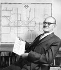
 Frank Pick © TfL/London's Transport Museum
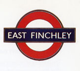 The new roundel, c.1918 Design: Edward Johnston © TfL/London's Transport Museum
 Harry Beck in 1965, holding an original sketch for the tube map made in 1931 © TfL/London's Transport Museum
 Tube Map, 1933 Design: Harry Beck © TfL/London's Transport Museum
 Hammersmith station, 1956 © TfL/London's Transport Museum
 London Underground station architecture, 1930s Design: Charles Holden © TfL/London's Transport Museum
 Speed, 1930 Design: Alan Rogers Advertising poster © TfL/London's Transport Museum
 Power, 1931 Design: E. McKnight Kauffer Advertising poster © TfL/London's Transport Museum
 Thanks to the Underground, 1935 Design: Zero (Hans Schleger) Advertising poster © TfL/London's Transport Museum
 London Transport - Keeps London Going, 1939 Design: Man Ray Advertising poster © TfL/London's Transport Museum
 Routemaster bus, 1954 © TfL/London's Transport Museum
| Article 16. London Transport Design Patron (1933-) Designing Modern Britain - Design Museum Exhibition Until 26 November 2006 From the 1918 red, white and blue roundel symbol, to the 1933 diagrammatic underground train map, and the 1956 Routemaster bus, many of the most familiar design icons of Britain belong to LONDON TRANSPORT in its heyday during the first half of the 20th century. Now the butt of stand-up comedians’ jokes for scruffiness and inefficiency, in the 1930s the London Transport network of underground trains, buses and trams was regarded as the world’s most progressive public transport system and a role model of enlightened corporate patronage of contemporary art and design. The red, white and blue roundel symbol designed by Edward Johnston for the Underground in 1918 and adopted by the newly founded London Passenger Transport Board in 1933 has come to symbolise the whole of London, not just its transport system. The same can be said for the diagrammatic London Underground map devised by Harry Beck in the early 1930s, which has since been imitated all over the world as a model of modern map design. In its golden era of the 1930s, London Transport was also an important patron of contemporary art. Eminent artists such as Man Ray and Graham Sutherland created publicity posters, while Paul Nash designed upholstery fabric for the seats of trains, trams and buses. London Transport commissioned work from noted designers, such as Hans Schleger and László Moholy-Nagy; while the poet, John Betjeman, wrote its tourist leaflets. Many of the most famous examples of London Transport design were commissioned by Frank Pick (1878-1941), a Lincolnshire-born solicitor, who joined the Underground Group in 1906 and became managing director of the LPTB in 1933. Convinced that London Transport should be an exemplar of design excellence, Pick commissioned work of the highest quality for everything from station architecture, to litter bins. He ensured that it was implemented with great rigour, regularly travelling the length and breadth of the network, often late at night, to check that every detail was up to scratch. After Pick’s departure in 1940, his work was continued by the publicity manager Christian Barman. Yet standards slipped. With the exception of occasional flashes of inspiration, such as the introduction of the Routemaster Bus in 1956 and the construction of landmark Jubilee Line stations in 2000 – notably by Foster & Partners at Canary Wharf and Michael Hopkins at Westminster – London Transport has lost its reputation for design excellence. It is now best known for the vestiges of its early 20th century design projects. THE ROUNDEL, 1918 Among the earliest – and most enduring – manifestations of London Transport design is the bar and circle of the roundel symbol, the first version of which was introduced in 1908 with a solid red circle at the centre. In 1918, Frank Pick commissioned the typographer Edward Johnston to revise the roundel so that it was suitable for use both as a company logotype and in station signage. Johnston replaced the solid red circle with a circular frame and introduced Johnston Sans, the typeface he had designed for the Underground Group two years previously, to spell out the company or station name in white across the central blue bar. The proportions of the new roundel were defined by those of Johnston’s typeface, which had been designed with legibility in mind to be read by busy passengers across crowded platforms. The resilience of Johnston’s roundel was proven in 1935 when the graphic designer Hans Schleger adapted it for use in the first bus stop signs. DIAGRAMMATIC UNDERGROUND MAP, 1931 By the early 1930s, the London Underground network had expanded so considerably that it had become increasingly difficult to squeeze all the new lines and stations into a geographical map. Passengers complained that the existing map was crowded, confusing and hard to read. It was decided that the network was now too large to be represented geographically and Harry Beck (1903-1974), who worked for London Underground as a draughtsman, was commissioned to devise a new diagrammatic means of doing so. Basing his map on an electrical circuit, Beck represented each line in a different colour and interchange stations as diamonds. The crowded central area was enlarged for legibility and the course of each route was simplified into the form of a vertical, horizontal or diagonal. The diagrammatic map was produced on a trial basis in 1933 as a leaflet and Beck continued to refine it until 1959. His design has inspired the maps of underground networks from New York to Sydney, and a variation of his original design is still used by London Underground today. 1930s UPHOLSTERY FABRICS Obsessed by the need for every element of London Transport’s activities to be designed – and maintained – to the highest possible standard, Frank Pick insisted that even apparently minor fixtures were specially made for the new network, including the fabrics to upholster the seats of its buses and trains. When the London Passenger Transport Board was formed in 1933, most of the upholstery fabric used in its vehicles was moquette, woven by the jacquard process from wool and nylon backed by cotton. Moquette was exceptionally durable, but the designs were purchased off-the-peg from the manufacturers. Pick and Barman decided to commission designs specifically for London Transport. They approached prominent designers and artists including Marion Dorn, Norbert Dutton, Enid Marx, Paul Nash and, later, Marianne Straub. Many of their designs – such as Nash’s 1936 Alperton, Marx’s 1937 Brent and Dorn’s 1938 Leaf – were used by London Transport until the late 1950s, when plainer, less obtrusive fabrics were introduced. 1930s PUBLICITY POSTERS Personally passionate about the visual arts and firmly of the belief that a responsible organisation like London Transport should inspire and educate the people who used its services, Frank Pick was characteristically ambitious in his choice of artists and designers to create posters for the network. Many of the most famous artists of the time, including Graham Sutherland and Paul Nash, accepted his invitation and passengers looked forward to seeing their latest work. Pick organised exhibitions of the posters – and other examples of modern art and design – in the booking office at Charing Cross Station. Among the first artists to create posters for London Underground was the US-born painter Edward McKnight Kauffer (1890-1954) who was commissioned by Pick in 1915, a year after his arrival in London. Obsessed by cubism, Kauffer introduced many elements of the emerging modern art movement to his posters in a bold, but fluid style. An exceptionally beautiful poster was created by the US surrealist Man Ray in 1938, when he juxtaposed the roundel against an image of a planet in the night sky. The 1930s was an invigorating period when the British modern movement was enriched by European émigrés fleeing Nazi oppression. Pick and Barman were swift to commission them, including the Hungarian-born László Moholy-Nagy and the German designer Hans Schleger whose 1935 depiction of the refugee ‘Zero’ in Thanks to the Underground is one of the most memorable posters created for London Transport. 1930s STATION ARCHITECTURE The foundation of London Transport as a new entity in 1933 coupled with the expansion of its network, notably the extension of the Piccadilly Line, offered a rich opportunity for Frank Pick and his team to embark on an ambitious programme of construction and reconstruction of stations, ticket offices and termini. Pick employed the architect Charles Holden (1875-1960) to create a new architectural idiom for the network. “Nothing shall be built, which has not been specifically designed to conform with the architecture scheme,” decreed Pick, who insisted that the design of station signage, furniture and even litter bins should be in keeping with that of the building. He and Holden made several foreign trips to investigate the modern architecture of Germany, the Netherlands, Denmark and Sweden. The result was a succession of uncompromisingly modern buildings such as the gleaming brick and glass stations at Boston Manor, Sudbury Town, Arnos Grove, Southgate and Oakwood. The chief characteristics of their British take on continental European modernism were sweeping curves with geometric detailing, exposed brickwork and concrete which, at the time, seemed daringly modern. ROUTEMASTER BUS, 1956 The double-decker bus, which has become such an evocative symbol of London, was first introduced in 1925 when the London General Omnibus Company finally secured official approval for buses with covered top decks. The first double-decker was the NS-type, but the most memorable was introduced thirty years later when the Routemaster took to the road. Developed over nine years from 1947 to 1956 by a team led by the industrial designer Douglas Scott (1913-1990) and bus engineer Albert Arthur Durrant, the Routemaster was designed with mass-production in mind. By constructing a bus from the maximum number of interchangeable parts, they cut the cost not only of the initial tooling and manufacturing, but of repairs and maintenance too. They also equipped it with the latest automotive engineering innovations such as power steering, an automatic gearbox, hydraulic brakes, independent springs and heating controls. Passengers loved the Routemaster for Scott's distinctive ‘brick’ silhouette, with a flatter front and less prominent engine than its predecessors, and for its appealing interior features. Scott styled the interior in tartan moquette, red leathercloth and Chinese yellow with soft tungsten lighting and shiny stainless steel fittings. He also finessed such details as the ‘lovers’ seat’ at the back and wind-down windows. The Routemaster remained in active service for nearly fifty years. After several reprieves, it was finally withdrawn in 2004. BIOGRAPHY 1906 Frank Pick arrives at the Underground Group as assistant to Sir George Gibb, the new deputy chairman. 1908 Pick is appointed publicity manager of the Underground Group. The first version of the roundel ‘bar and circle’ symbol is introduced with a solid red circle. 1915 Edward McKnight Kauffer starts to design posters for the Underground Group. 1916 Pick commissions the typographer Edward Johnston to develop a super-legible typeface for use throughout the Underground – Johnston Sans. 1918 Edward Johnston begins work on the redesign of the roundel symbol used by the Underground Group since 1908. 1925 Architect Charles Holden starts work on the design of stations for the Morden line extension. Introduction of the first double-decker bus in London, the NS-type. 1928 Charles Holden designs a new headquarters for the Underground Group above St James Park tube station at 55 Broadway. 1930 Construction begins on the extension of the Piccadilly Line to the north and west. 1931 Sudbury Town opens as the first landmark Piccadilly Line station. Draughtsman Harry Beck starts work on the design of a diagrammatic map to guide passengers around the sprawling Underground network. 1933 Merger of the Underground Group with four other underground companies and numerous bus and tram companies to form the London Passenger Transport Board with Frank Pick as managing director. Edward Johnston’s roundel is adopted as the new network’s symbol and Harry Beck’s map is piloted as a leaflet. 1934 Introduction of the bus shelter to protect passengers from the wind and rain. 1935 Bus stops, designed by Hans Schleger as a variation of Johnston’s roundel, are piloted on the route between Euston Road and Seven Sisters Road, then introduced throughout the network. 1938 Introduction new streamlined, more spacious tube trains, which remained in service on the Bakerloo and Northern Lines for fifty years. 1939 Man Ray completes the London Transport – Keeps London Going poster juxtaposing Johnston’s roundel against a planet in a night sky. 1940 Pick resigns from the LTPB on a point of principle and dies the following year. 1947 Work begins on the design of the Routemaster bus. 1956 The Routemaster bus is introduced to service. 1962 The government gives the go-ahead for the construction of the Victoria Line with then-radical automatic ticket machines and barriers and one-person trains. 1979 Opening of the first stretch of the Jubilee Line. 2000 Opening of the landmark stations of the Jubilee Line extension – notably Southwark, Bermondsey, Westminster and Canary Wharf – to link the West End with South East London and Docklands. London Transport is replaced by the newly constituted Transport for London. FURTHER READING Visit the London's Transport Museum website at www.ltmuseum.co.uk James Laver, Art For All: The Story of London Transport Posters, Shenval Press, 1949 Nikolaus Pevsner, Frank Pick, Studies in Art, Architecture and Design, Vol 2: Victorian and After, Thames & Hudson, 1968 T. C. Barker + Michael Robbins, A History of London Transport, Vol 2: The Twentieth Century to 1970, Allen and Unwin, 1974 Christian Barman, The Man Who Built London Trasnport – A Biography of Frank Pick, David & Charles, 1979 Laurence Menear, London’s Underground Stations, Midas Books, 1983 Oliver Green, Underground Art, Studio Vista, 1989 Douglas Rose, The London Underground: A Diagrammatic History, Douglas Rose, London 1986 Les Burwood + Carol Brady, London Transport Maps: A concise Catalogue, Burwood + Brady, Woking, 1992 designmuseum.org |
Не нашли, что искали? Воспользуйтесь поиском: